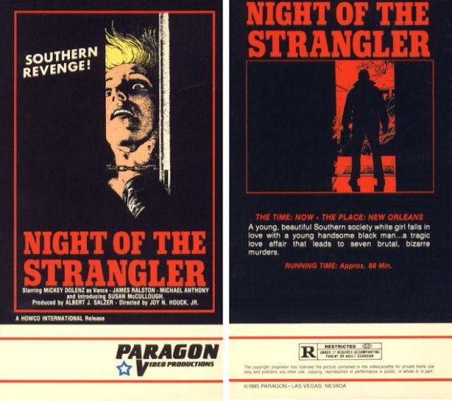
Posts

Showing posts with the label sex

Twinsanity

Image
I'm a bit torn, I admit. On one hand, the name Twinsanity is so stupid that I can't help but love it, on the other, its alternate title, Goodbye Gemini, is so cool that I feel it's the more appropriate title when trying to sell the film to a wider audience. I'm just not sure which I really wanna like more, but for the sake of this post, we'll be calling it Twinsanity, just because this blog is about dumb VHS decisions and it don't get dumber than pun titles like that. Released in 1970, it is a British psychological horror film based on the novel "Ask Agamemnon" (a title which is somehow the worst of all 3 despite being the original) by author Jenni Hall. It's a run of the mill film about a pair of unusually close pseudo incestuous twins who commit a murder, and then deal with the aftermath. Nothing too fancy or original here, to be honest. But this isn't a review blog. Well, it kinda is, but not of the films. This is a blog about the artwork pr...

Werewolf Woman

Image
I don't know, maybe it's just me, but that werewolf sure resembles an angry terrier more than it resembles a werewolf. Not that angry terriers aren't horrifying. They can be vicious little bastards. I'm just saying...if you're going to make a werewolf, make a werewolf, not something that resembles your aunts pissy little dog. Then again, we are discussing yet another Italian horror movie made in 1976 which is barely horror from what I've read, so perhaps I'm asking too much from them. Either way, "Werewolf Woman", which is a terrible title but not nearly as terrible as some of the alternatives which we'll discuss in a second, is yet another example of a film in which a woman is raped, then makes that entire incident her characterization. In fact, the sexual assaults seems to weigh more on her as a person than the fact that, you know, she's a goddamned werewolf. And I'm not trying to speak lightly of people who've endured sexual assa...

Hitchhike To Hell

Image
Once more, we dive back into the gift that keeps on giving, a nonstop ordeal on this blog, a classic family favorite topic...strangulation! This is one of those rare cases where there's nothing really specific about this box art that jumps out at you, it's just that the whole thing is bad. Like, this entire thing is an assault on your eyes, and frankly I'm not even sure where to begin pressing the blame first. Should we start at the hideous nuclear yellow vomit they colored the outside with, or perhaps the ridiculous font for "Hell"? Or maybe, just maybe,the bizarre idea to put yet another woman being choked to death on the cover, even though it takes you a full few minutes to really comprehend that that's what you're actually looking at? As I said, there's no real starting point; the whole thing is a goddamned travesty. The description on the back, "A horrific story of the rape and murder of countless runaway girls by a homicidal maniac", i...

The Hollywood Strangler Meets The Skid Row Slasher

Image
If this blog has anything resembling a tradition, I'd be willing to say that tradition is covering terrible movies about strangulation. Whether it was The Invisible Strangler or Night Of The Strangler , we seem to run across this genre in particular far more than anything else, don't we? Well, I'm happy to officially make it a regular ongoing tradition! So long as I keep stumbling upon terrible strangulation films, I'll continue to share them with you, whether you like it or not. So with that in mind, let's discuss this box. It...isn't...terrible, I guess? It's not great by any stretch of the imagination, nor is it vaguely visually imaginative but, it's also not outright atrocious. It really at least gets the message across, if nothing else, even if that message is just "people get strangled". Despite the title sounding like a sleazy, terrible Abbot & Costello title, I've always personally been a fan of dueling serial killer concepts. ...

Night Of The Strangler

Image
It's not often something like "Night of the Strangler" would be the kindest title given to a film, but here we are. I'm not even kidding, you guys. You wanna know what some of the other titles for this film were? The Ace of Spaces, which sounds like a scifi movie, Dirty Dan or Dirty Dan's Woman, which sounds like a Western about a lone gunman hunting down a woman who did him wrong for revenge, Vengeance is Mine which is...just...so very vague and, quite possibly the worst of them all has to be Is The Father Black Enough? Because wow, that's just...that's a hell of a title. Even better than the title, however, is the tagline for it, which read thusly, "A racist wind blows the dust from a Black man's grave to choke the honkies to death!" Absolutely magnificent, honestly. The film is fairly poorly produced it seems, with boom mics being notably visible in multiple shots, and, even weirder, despite both a lyricist and vocalist being credited, abs...

S.S. Experiment

Image
Before Nazis became a regular fixture in our day to day lives again, we used to love using them as cinema fodder. Sadly, now looking back on our staples of bad b movies often makes us cringe because they're no longer funny mockeries of villains and instead actual people once again hurting everyone in the current day and age. That's really what's hurt the most from this influx of modern day Nazism, is that they're ruined Hitler as a comedy icon for the rest of time. Anyway, this time, we're looking back at yet another awful b horror movie, S.S. Experiment, or, as it's titled otherwise, "S.S. Experiment Love Camp" which might be the funniest fucking movie title I've ever heard bar none. I have to admit, the Jewish part of me is appalled at this artwork, but the lesbian part of me is in love with it. That's a pretty hot visual, not gonna lie, even if it is somewhat male gazey. I think, though, what bothers me the most about this artwork is how it...

Gore Whore

Image
This is a hard one to be mad about, because, if we're being totally honest...I genuinely kinda love this. It's one of those "so ridiculous it's great" examples, because there's not really anything super outstanding or downright original about it, design wise, but it's also so out there that I can't help but appreciate it on multiple levels that even I, quite frankly, don't fully understand. The cover is what it is, an attractive young woman covered in blood - a visual that a demented horror loving lesbian like myself can't help but adore - and the back has her in short shorts and a hawaiin-esque shirt while brandishing a pistol, ready to smoke anyone who comes near her. Clearly, a woman after my own heart. She might eat that heart, but hey, that's the price you pay for love I guess. Then we've got the screenshots which, aside from the first and third, are pretty spectacular in and of themselves because for once, even outside of context ...

Erotikill

Image
Erotikill is what happens when horror meets horniness. Nothing goes more hand in hand with death than sex. Let me tell you, nothing gets me hotter than having lesbian sex and then going out to commit murders together. And, for a change, this box isn't actually that bad. It's got an almost vaporwave quality to it, but overall it isn't actually too terrible. It's not fantastic either, by any means, especially the back, but it's alright. You've got this cool dual image of your lead and then your lead as a skull, which is a nice comparison shot. Hell, even the title font is pretty neat, plain as it seems to be. Though, if I have any issues to gripe about with the cover it's that they should've done her whole face as one image instead of this actual mirroring. One half of her face as fleshy, the other as skeletal. That would've been a lot better. And the back, as always plagued by the ever present "multiple out of context screenshots" we've ...

Shock Waves

Image
This woman looks more like she's having fun playfully tugging at her overshirt than she's genuinely annoyed that some creature from the depths of a watery grave is trying to drag her down to him. Oh sure lady, laugh it up, laugh it up until you're down there too, never to be seen or heard from again all because you didn't take river ghouls seriously enough to not act like you were involved in some weird playboy photo shoot when one came at you, intending to make you his prisoner wife. Lady, tut the Coppertone Girl shit and take this seriously. Along with the bizarre tone of the photo itself is the font, which, I have to admit, is pretty cool in and of itself, but really makes this feel more like some sort of weird pseudo horror themed workout video than an actual horror movie proper. Also very cute putting the actress's name, Brooke Adams, right on the water itself. Nothing like good ol' H20 related jokes to liven up a box art. And then, to top it all off, we...

Blood On Satan's Claw

Image
This is...I don't even know how to start this one, quite honestly, you guys. I guess I'll state that it only makes sense that there's a sticker on it from a place called Movie America, because only Americans could make something so absolutely fucking awful. The colors, the layout, the fonts, everything about this shits the bed. The title of the fucking thing is on the front, the spine AND the back, ya know, just in case you forgot in the last 30 seconds or something. Thanks for the constant reminder. God forbid I might've forgotten what it was called otherwise, without your incessant reiteration! And while the layout of this case is nothing particularly awful - in fact, regular readers will recognize at this point that it's fairly standard, honestly, for the time period - it's also somehow even worse than others that follow the same design. First of all, and I really wish I could stop saying this but apparently enough people disagree, but the font on the spine i...

Demon Queen

Image
It feels good to go back to your roots, the place you came from, like with this blog and how it started with just god awful horror movies. And nothing says "god awful horror movie" than a terribly drawn cover and puke green box coloration.  Demon Queen is a movie of such little notariety that Letterboxd has a single sentence for its synopsis. That's what you call a good time. From the screenshots on the back, it's incredibly clear right from the get go that we're dealing with renegade movie makers here. This is clearly not a studio backed project, because, even in 87, when this thing was birthed, with the gruesomeness of horror becoming a mainstream staple of cinema and a somewhat respectable genre finally, studios wouldn't back this sort of thing. Just look at what's there and you'll understand why. It's just a bunch of brutally murdered women, horrors favorite subject to violence, and someone with their face melted off their skull. A pretty cool ...

Aerobicide

Image
This fucking thing, man. There's so much wrong with this, and all its subsequent variants, which we'll also cover. Let's start with the sheer fact that this womans proportions are absolutely ridiculous. I'm not a very big breasted lady myself, but holy god damn, this woman is more tit than person at this point. Seriously, this lady probably has back problems because of the size of her chest, it's ludicrous. I'm not against using sex to sell something, and sex and horror often go hand in hand, but this thing is oversexed to the point where it makes me almost wonder if it's just a porn parody of a horror movie. Of course I know it's not, but still. The images on the back are of no help, because we have a woman screaming at seemingly nothing, a man who appears to be aiming a gun, and then just TNA everywhere else. They were really depending on horny movie goers to rent this flick. Also the grey surrounding everything else is just an odd color choice and kin...

The Alien Dead

Image
    Boy do I have a doozy for you guys this time, folks.   This is a movie called, as the gigantic font taking up half the fucking front cover will tell you, "The Alien Dead". Let's just start with the fact that that's a terrible ridiculous title that really doesn't even remotely suggest what the film is about. Are the aliens dead? Are the aliens simply raising the dead? Really incoherent. And while the font itself is pretty alright, it's the collage box underneath it that really nets this cover a spot on the blog. This thing is just....oh man, it looks bad, guys. It looks like something an 8th grader would make in their graphic design class. But, like, back in the mid 2000s, before everyone was a bona fide graphic design artist like today. The unusual thing about this one is how we get the same familiar "no context collage" that we usually get on the back, but this time it's on the front . Subverting expectations, I see. Then on the back, we...