Posts

Showing posts with the label suicide

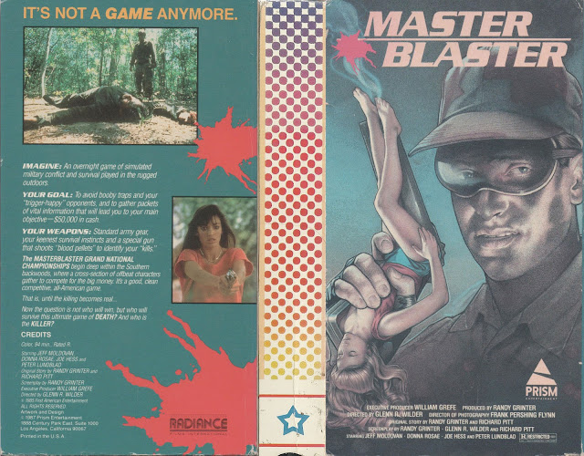
Master Blaster

Image
You know, I know it's common place for men to call their beloved objects by female pronouns, for example when referring to their classic Camaro they may say "Isn't she a beaut?", but I think this one might go a little too far. Master Blaster, contrary to what its cover might indicate, is sadly not a film about a maniacal evil genius who makes tiny women into guns, which is a shame, because that sounds endlessly entertaining. Instead it's a pretty cut and paste concept we've seen a million times before regarding a competition based around money that goes horribly horribly wrong, much like the production of this movie I would imagine. Front art aside, I think my personal favorite part of this box design is the spine, which I can only assume was intentionally left blank so when friends viewed your shelf of films they didn't see this alongside others. The artwork on the spine looks like the cheap tablecloth used at a local family run pizzeria, which only makes...
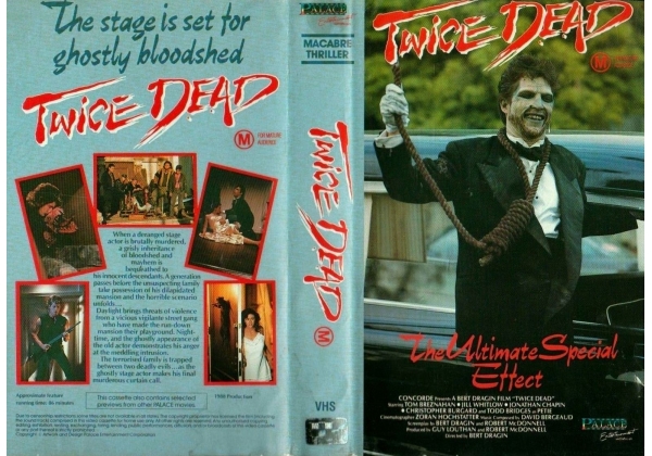
Twice Dead

Image
"Honey, your prom date, Hanged Slightly Overweight Limo Chauffeur, is here!" Twice Dead, a title that would've worked better for the 2nd movie in a series rather than the first but who's arguing semantics at this point on the blog, is a 1988 directed by Bert Dragin, a man who somehow has simultaneously the best and worst names combined. Not gonna lie, at first glance, I almost thought this was a somewhat educational tape for beginner special effects artists who wanted to learn the trade, thanks to that rather innocuous tagline, "The Ultimate Special Effect". Maybe not the best idea to put it there, and in such goofy font, compared to the wicked cool title font. So, what is Twice Dead? Well the synopsis reads as such: The Cates family is thrilled to learn they have inherited the old mansion of the deranged stage actor, Tyler Walker. They arrive to discover that the mansion has turned into a playground for a local street gang. But the gang is not all the Ca...

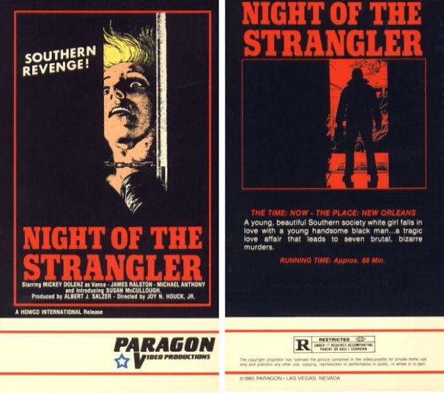
Night Of The Strangler

Image
It's not often something like "Night of the Strangler" would be the kindest title given to a film, but here we are. I'm not even kidding, you guys. You wanna know what some of the other titles for this film were? The Ace of Spaces, which sounds like a scifi movie, Dirty Dan or Dirty Dan's Woman, which sounds like a Western about a lone gunman hunting down a woman who did him wrong for revenge, Vengeance is Mine which is...just...so very vague and, quite possibly the worst of them all has to be Is The Father Black Enough? Because wow, that's just...that's a hell of a title. Even better than the title, however, is the tagline for it, which read thusly, "A racist wind blows the dust from a Black man's grave to choke the honkies to death!" Absolutely magnificent, honestly. The film is fairly poorly produced it seems, with boom mics being notably visible in multiple shots, and, even weirder, despite both a lyricist and vocalist being credited, abs...

The Returning

This summary is not available. Please click here to view the post.

Death Spa

Image
I spend a lot of my time writing, as evidenced by the constant updating of these blogs. This means, inevitably, that I spend a lot of time thinking of ways to promote said writing, which generally ends up with me thinking of easy to swallow catchphrases or brief paragraphs that explain the work it is I'm trying to share. With that being said, I can not , for the life of me, no matter how hard I try, think of a worse tagline for something than "You'll Sweat Blood." That doesn't sound like an advertisement for a horror movie, that sounds like a side effect of some bad medication. Like, that tells me absolutely nothing except that this movie apparently intends to do me bodily harm just by watching it, which, looking at this box, I fully believe. I'm glad they give us a list of people responsible for this nightmare, but it's a rather weird decision to stick that list on the front cover right under your art. Still, it's nice to know who's house to ...

Death Wish Club

Image
So, I guess I'll start off by saying that this cover looks a rainbow vomited onto a fart. Like, visually, that's the first thing I think of upon seeing this color palette. Now, while at first glance this may appear not all that interesting to look at, there's actually a lot more going on here than you'd think. Let's start with, once again, these companies hiring the absolute lowest tier artist possible to draw their horrifying humanoid creatures they've plastered on the front of this monstrosity, that I sincerely hope aren't actual representations of the people in the movie, because if they are, then god those poor ugly people. Again, if you're going to through all the trouble of financing and producing a filming a picture, why would you drop the ball at the very last part of that? Why would you hire the worst people to create the thing that's going to be the first visual representation of your finished product on a shelf somewhere? Makes no se...