Posts

Showing posts from October, 2020

The Mad Butcher

Image
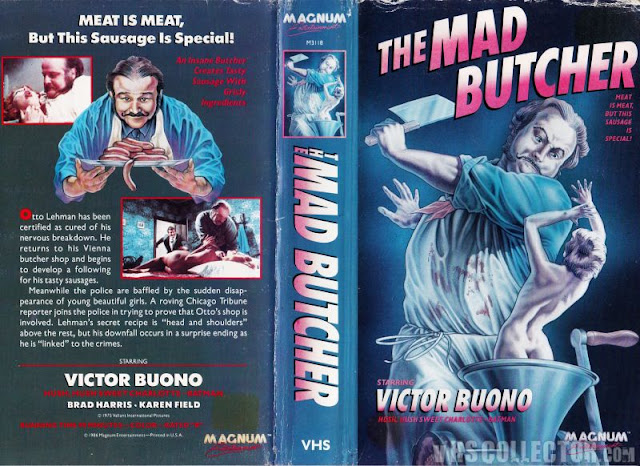
I have, like, so many questions. Every now and then I'll come across a box art that doesn't disgust me as much as it bewilders me, and this is one of those times. I can't really talk shit about the art itself, because - quite frankly - it's not all that bad. It's well drawn, it's detailed, and what colors do exist are very appropriate for the subject matter. But it's just so god damned confusing that it warrants a discussion no matter what. Let's first ask why, perhaps, this man appears to be butchering shrunken women. Does his kitchen have an infestation of small fairy like ladies that's gotten out of hand? What did these poor tiny women ever do to this man to deserve such a brutal end? And also, why is he attacking her with a butcher knife when she's so clearly already inside of a meat grinder? Just crank it, dude. You don't need to stab her. Maybe it's cause she has bones, and that's harder to grind, maybe that's why he needs t

Blood On Satan's Claw

Image
This is...I don't even know how to start this one, quite honestly, you guys. I guess I'll state that it only makes sense that there's a sticker on it from a place called Movie America, because only Americans could make something so absolutely fucking awful. The colors, the layout, the fonts, everything about this shits the bed. The title of the fucking thing is on the front, the spine AND the back, ya know, just in case you forgot in the last 30 seconds or something. Thanks for the constant reminder. God forbid I might've forgotten what it was called otherwise, without your incessant reiteration! And while the layout of this case is nothing particularly awful - in fact, regular readers will recognize at this point that it's fairly standard, honestly, for the time period - it's also somehow even worse than others that follow the same design. First of all, and I really wish I could stop saying this but apparently enough people disagree, but the font on the spine i

The Headless Eyes

Image
You guys. Come on, you guys. This isn't hard. Why is it so tough for you to make something that isn't incomprehensible visually? I just...I don't even know anymore, man. Every single week I have to come back here and teach you guys about graphic design, and you're the ones presumably doing graphic design for a living. How is this even possible? Alright, let's get into it, I guess. For what it's worth, let's start with a compliment, and that's that the artwork itself isn't all that bad. That's a nice look eyeball, despite the title making it sound like there's multiple eyes, but whatever. Let's ignore that for now. But seriously, top notch artistry went into visually crafting that eyeball, and I love him. The bleakness of the background, the city in the distance, the woman who - I'm assuming is a victim, unless that's HER eyeball that crawled out of her skull, which would make sense given she's covering her face with her hand -

Demon Queen

Image
It feels good to go back to your roots, the place you came from, like with this blog and how it started with just god awful horror movies. And nothing says "god awful horror movie" than a terribly drawn cover and puke green box coloration.  Demon Queen is a movie of such little notariety that Letterboxd has a single sentence for its synopsis. That's what you call a good time. From the screenshots on the back, it's incredibly clear right from the get go that we're dealing with renegade movie makers here. This is clearly not a studio backed project, because, even in 87, when this thing was birthed, with the gruesomeness of horror becoming a mainstream staple of cinema and a somewhat respectable genre finally, studios wouldn't back this sort of thing. Just look at what's there and you'll understand why. It's just a bunch of brutally murdered women, horrors favorite subject to violence, and someone with their face melted off their skull. A pretty cool