The Mad Butcher
I have, like, so many questions.
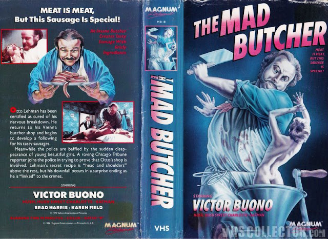
Every now and then I'll come across a box art that doesn't disgust me as much as it bewilders me, and this is one of those times. I can't really talk shit about the art itself, because - quite frankly - it's not all that bad. It's well drawn, it's detailed, and what colors do exist are very appropriate for the subject matter. But it's just so god damned confusing that it warrants a discussion no matter what. Let's first ask why, perhaps, this man appears to be butchering shrunken women. Does his kitchen have an infestation of small fairy like ladies that's gotten out of hand? What did these poor tiny women ever do to this man to deserve such a brutal end? And also, why is he attacking her with a butcher knife when she's so clearly already inside of a meat grinder? Just crank it, dude. You don't need to stab her. Maybe it's cause she has bones, and that's harder to grind, maybe that's why he needs the knife. I don't know, I'm a not an expert in the field of tiny person murder.
Also, the tagline. As always, questionable, at best, but in this case, just kind of downright contradictory, because it reads
"Meat is meat. But this sausage is special!"
which...in all fairness, just doesn't make sense. If all meat is meat, how can this particular meat be special? It's still just meat. You literally said that, a sentence beforehand. Stop contradicting yourself! Certainly, to a cannibalesque killer, all meat would just be meat. There's no differentiating between the meat of a person and the meat of something you scraped off the road. Venison and human are the same, to you. But you can't say that all meat is meat, and then claim this particular meat is somehow special, because it isn't, because you just said all meat was just meat. Do you see the problem here? Your wording is arguing with itself.
The screenshots on the back aren't anywhere near as terrible as the godawful faire we're usually treated to, but that doesn't make them much better either. You've still got some completely contextless screenshots that, ultimately, don't really add or subtract to the content. They're just kind of...there. But this box isn't that bad, really. I mean sure it's got its problems with its totally confusing artwork that shows what appears to be Emeril's twisted half brother murdering Tinkerbell, and a tagline that ultimately works against itself, but ultimately it isn't that bad. The artwork, as I stated - confusing as it may be - is pretty solid, and the colors and the layout and everything all work in tandem to create what is ultimately a visually solid piece. Could be worse. Could've been this.
Could've been a bad font matched with a guy who doesn't really seem to represent the person in the movie slicing up a clearly fake pair of legs while an amorphous blob of hamburger meat that's been through a blender sits on the table and watches. So yeah, could've been worse. Could've been this. Could've had a goddamned pun for a tagline. Puns are nearly in every single horror VHS box, and it's unforgivable, really. The box that relies on puns to sell their horror has really run out of ideas.
And, a question, if I may...why's there a loose hand under the table? Did that just get dropped down there and forgotten during his time murdering? I'll give this box this much, at least he's murdering a real sized person, and not a naked Polly Pocket. Though I have to admit, that amorphous blob of blendered hamburger meat doesn't look like it could've come from a human. It's too....clean. It's the meat version of sawdust. And he's not even in the act of butchering, here, he's just merely holding a blade over a perfectly fine leg. A leg that doesn't look like it's been attacked at all thusfar.
But, even as bad as this one is, it could always be worse. Sure this one looks like they did this photoshoot on a construction set and dropped some silted meat on top of a plank, but at least it's still somewhat visually interesting, they're still trying, you know? Gotta give 'em props for that at least, if nothing else. Effort, even poor effort, is still effort. And I would never bash anyone who at least puts the modicum of effort into their attempts. So yeah, this box is bad too, but it could always be worse. It could always be this.
Why Dennis Franz's Sipowicz is cutting up a womans leg in a hallway is a question that'll likely never get answered, but I feel needs to be asked nonetheless. And where is the blood on this knife from, because this lady looks freshly killed, so if he's not cleaning his knives in between butcherings, he's not a very good chef. That's a clear violation of health code. Not to mention it just looks like ketchup. This whole thing has the stink of "poorly constructed last minute Halloween photoshoot" to it.
"Hey, where can we take a crappy half assed picture for this box?"
"Well, Dave has a hallway."
And this one was released by Star Classics, which, I can't believe I have to state this but apparently I do, if you consider this sort of film a "classic" then perhaps it is time you reconsidered your taste in cinema. In hindsight, perhaps that first box really is a masterpiece, especially when compared to these other two. At least that one has nicely done artwork and you can tell actually was made by people who sort of at least cared. Evil butcher murdering victims of Rick Moranis's shrinking machine aside, that first box had a lot more going for it.
So that's The Mad Butcher, in all 3 of its gloriously goofy incarnations. You know, we should count ourselves lucky, because generally, even when a box has multiple art (which is most of the time, let's be honest), none of them wind up being good. At least in this case, we got one solid box out of it, and really, that's more than we deserve.
I think the real takeaway from this is that it could always be worse.
And a lot of times...it is.


Comments
Post a Comment