Posts

Showing posts with the label kung fu

Fists Of Blood

Image
So, I have questions. I can't be guaranteed I'll be given answers, but I have questions nonetheless. I suppose my first question would be what in the fresh hell is going on on this cover? Because for all intents and purposes, it appears that a man has just fisted a VHS box - violently, I might add, given the blood on his hand - while a well armed member of the Gay Agenda looks on in shock at the sinful display of heterosexuality going on just within his peripheral vision. Also, and maybe this doesn't matter since I'm a lesbian, but I would never fuck a man named Jason Blade. I mean, that's the kind of name a teenager gives his edgy self insert. Also, the description on the back basically tells you everything that's going to happen, leaving no mystery, so you don't even need to watch the movie, you can just read the movie. But the odd thing is, this is the only piece I could find for Fists of Blood, because it also went by a second title, a title much cheesie...
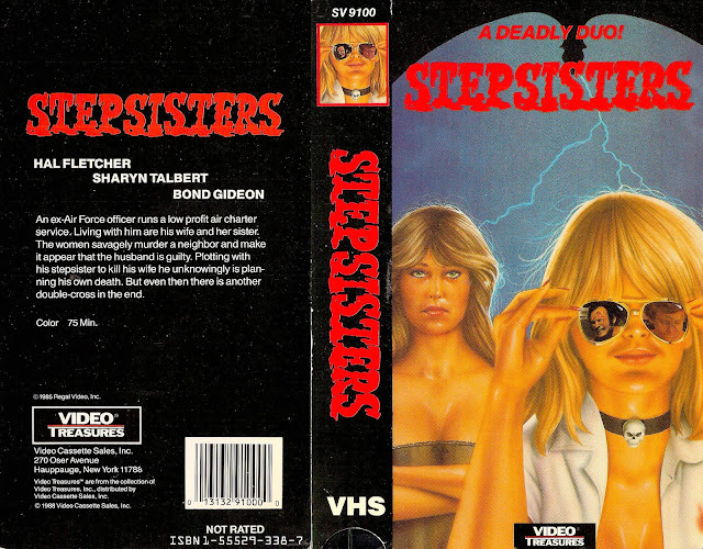
Stepsisters

Image
"You expect me to die?!" "No, Mr. Bond Gideon, I expect you to act in this feature." "You... monster! " I have to admit, on the whole, this isn't anywhere near the worst design I've ever seen. It's consistent and it's color coordinated, even if those colors are reminiscent of a decaying kiddie pool full of sunburnt vomit. But hey, the title font isn't terrible, the layout is, boring, yes, but viewable at the least and the artwork isn't wholly atrocious. "Stepsisters", also known as "Hands of Blood" - a way cooler title, if we're being honest - is a self proclaimed thriller released in 1974 directed by a man named Perry Tong, also known for the films "Deadly Assets" (2018) which I'm fairly certain is just a porno and "Slick Silver", also from 1974. There's only one review on IMDB for the film, a review titled appropriately "Nothing Worth Remembering", which I feel pretty m...

Death Wish Club

Image
So, I guess I'll start off by saying that this cover looks a rainbow vomited onto a fart. Like, visually, that's the first thing I think of upon seeing this color palette. Now, while at first glance this may appear not all that interesting to look at, there's actually a lot more going on here than you'd think. Let's start with, once again, these companies hiring the absolute lowest tier artist possible to draw their horrifying humanoid creatures they've plastered on the front of this monstrosity, that I sincerely hope aren't actual representations of the people in the movie, because if they are, then god those poor ugly people. Again, if you're going to through all the trouble of financing and producing a filming a picture, why would you drop the ball at the very last part of that? Why would you hire the worst people to create the thing that's going to be the first visual representation of your finished product on a shelf somewhere? Makes no se...