Stepsisters
"You expect me to die?!"
"No, Mr. Bond Gideon, I expect you to act in this feature."
"You...monster!"
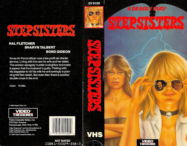
I have to admit, on the whole, this isn't anywhere near the worst design I've ever seen. It's consistent and it's color coordinated, even if those colors are reminiscent of a decaying kiddie pool full of sunburnt vomit. But hey, the title font isn't terrible, the layout is, boring, yes, but viewable at the least and the artwork isn't wholly atrocious. "Stepsisters", also known as "Hands of Blood" - a way cooler title, if we're being honest - is a self proclaimed thriller released in 1974 directed by a man named Perry Tong, also known for the films "Deadly Assets" (2018) which I'm fairly certain is just a porno and "Slick Silver", also from 1974.
There's only one review on IMDB for the film, a review titled appropriately "Nothing Worth Remembering", which I feel pretty much sums it up.
What really boggles me, though, about this box art is the bizarre decision to have a painting on the front of the lead actresses, but then having actual photographs of the male lead - I'm assuming it's a photograph, it's a little hard to tell to be honest due to its size - in her sunglasses reflection. I'm also not quite sure what that blue asscrack farting lightning behind them is supposed to be, but perhaps there's no rhyme or reason to anything here, and I'm just stupid for even trying to figure it out in the first place. Really though, this box falls into that rare middling category of "too boring to be bad", because while it's obviously got some problems, those problems aren't terrible enough to warrant a mockery of it. Sure, the artwork on the front womans face is just terrible (why does she look like a Pug who turned into a human woman?) but really it's just one of those that's so generic and bland that it doesn't even have enough to make fun of.
Though I do take issue with the phrase "Video Treasures" on the back. This is anything but a treasure, and if it is, please, let it remained buried under the sand for eons to come.
Although I do appreciate the 1988 "Video Cassette Sales" at the very bottom of the back. That's not a real company, right? I mean, that's a company not wanting to take the blame for having played a hand in releasing this bland abomination. Nobody would name their company that. That's like naming your car company "Motor Vehicles Incorporated". Hilarious.
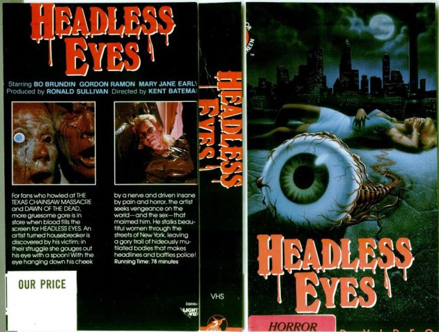
Thankfully, there's a variant for us to look at!


Comments
Post a Comment