Posts

Showing posts with the label love

The Mutant Kid

Image
This is a tough one. On one hand, this is as bad as always, but on the other, it's light years ahead of most of the stuff generally featured here. Because of this, it's hard for me to actually consider it bad, but considering the amount of questionable artistic decisions - and I use the work "artistic" extremely lightly here - I'm going to feature it anyway. Let's start with the obvious, the tagline. "Danny was perfectly normal, except...he glowed in the dark." First of all, you say this as if it's a detriment, when really it's a bonus. In what world is that a negative trait? No more flashlights, no more night lights, plus you'd be the most popular person at a rave. Danny's got nothing but a life of excitement ahead of him, believe me. He's gonna LITERALLY be the light in someones life! In fact, I'd wager to say that glowing in the dark is not nearly as bad as his bizarre size as a baby. Why is Danny the size of a Corgi? One o...

Twinsanity

Image
I'm a bit torn, I admit. On one hand, the name Twinsanity is so stupid that I can't help but love it, on the other, its alternate title, Goodbye Gemini, is so cool that I feel it's the more appropriate title when trying to sell the film to a wider audience. I'm just not sure which I really wanna like more, but for the sake of this post, we'll be calling it Twinsanity, just because this blog is about dumb VHS decisions and it don't get dumber than pun titles like that. Released in 1970, it is a British psychological horror film based on the novel "Ask Agamemnon" (a title which is somehow the worst of all 3 despite being the original) by author Jenni Hall. It's a run of the mill film about a pair of unusually close pseudo incestuous twins who commit a murder, and then deal with the aftermath. Nothing too fancy or original here, to be honest. But this isn't a review blog. Well, it kinda is, but not of the films. This is a blog about the artwork pr...

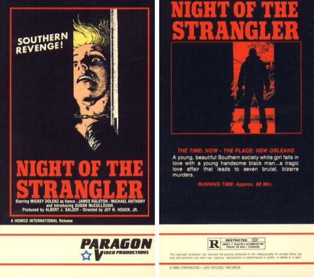
Night Of The Strangler

Image
It's not often something like "Night of the Strangler" would be the kindest title given to a film, but here we are. I'm not even kidding, you guys. You wanna know what some of the other titles for this film were? The Ace of Spaces, which sounds like a scifi movie, Dirty Dan or Dirty Dan's Woman, which sounds like a Western about a lone gunman hunting down a woman who did him wrong for revenge, Vengeance is Mine which is...just...so very vague and, quite possibly the worst of them all has to be Is The Father Black Enough? Because wow, that's just...that's a hell of a title. Even better than the title, however, is the tagline for it, which read thusly, "A racist wind blows the dust from a Black man's grave to choke the honkies to death!" Absolutely magnificent, honestly. The film is fairly poorly produced it seems, with boom mics being notably visible in multiple shots, and, even weirder, despite both a lyricist and vocalist being credited, abs...

S.S. Experiment

Image
Before Nazis became a regular fixture in our day to day lives again, we used to love using them as cinema fodder. Sadly, now looking back on our staples of bad b movies often makes us cringe because they're no longer funny mockeries of villains and instead actual people once again hurting everyone in the current day and age. That's really what's hurt the most from this influx of modern day Nazism, is that they're ruined Hitler as a comedy icon for the rest of time. Anyway, this time, we're looking back at yet another awful b horror movie, S.S. Experiment, or, as it's titled otherwise, "S.S. Experiment Love Camp" which might be the funniest fucking movie title I've ever heard bar none. I have to admit, the Jewish part of me is appalled at this artwork, but the lesbian part of me is in love with it. That's a pretty hot visual, not gonna lie, even if it is somewhat male gazey. I think, though, what bothers me the most about this artwork is how it...

One Away

Image
This doesn't even look like the cover to a real action film. It looks like the cover to what someone imagines an action film would look like. It looks like the cover to a parody of an action film. In fact, the release date for this picture is 1976 and this thing could not look anymore 70s if it tried. You've got a motorcycle, a naked woman and a helicopter, all done in the classic hand drawn cover art we've come to know and love. The description reads "A breathtaking motorcycle manhunt across the African wilderness", which makes it sound like they're hunting a sentient motorcycle who, I don't know, committed some sort of motorcycle crime and is now being chased for vengeance? He committed quite literal Grand Theft Murder and now the husband of the woman motorcycle he killed wants revenge but first he has to catch him? That sounds a lot better than this movie likely is. Actually, there's no real way for me to know, outside of watching the mov...

The Returning

This summary is not available. Please click here to view the post.

Death Spa

Image
I spend a lot of my time writing, as evidenced by the constant updating of these blogs. This means, inevitably, that I spend a lot of time thinking of ways to promote said writing, which generally ends up with me thinking of easy to swallow catchphrases or brief paragraphs that explain the work it is I'm trying to share. With that being said, I can not , for the life of me, no matter how hard I try, think of a worse tagline for something than "You'll Sweat Blood." That doesn't sound like an advertisement for a horror movie, that sounds like a side effect of some bad medication. Like, that tells me absolutely nothing except that this movie apparently intends to do me bodily harm just by watching it, which, looking at this box, I fully believe. I'm glad they give us a list of people responsible for this nightmare, but it's a rather weird decision to stick that list on the front cover right under your art. Still, it's nice to know who's house to ...

The Mutations

Image
"The Mutations" is a classic example of "not so bad it's terrible but still so bad it's bad" design wise. I don't know who ever had the idea of putting giant blocks over other images for these boxes, but it was a terrible idea and I hope they are in hell as I write this, especially since that style became almost the norm for a lot of these boxes. While there's nothing really atrocious about this, it's still pretty bad. I mean, the tagline is outright boring, "It's not nice to fool with mother nature...it can be HORRIFYING!" like, that does nothing for me, even when coupled with a seemingly grotesque image on the front that I guess they assumed would interest people into seeing it? I mean, it's not bad monster design, really, but overall it's not really anything to write home about either. Hell, it's not much to write about here for that matter. I also am highly skeptical of the "Hollywood Horror Collection...

Dynasty Of Fear

Image
You know that you're in for a bad time when the BEST cover you can find is this one, and it has the BEST TITLE to boot. Things don't go uphill from here, guys, sorry to say. This is only going to be a one way trip, and it's going to lead straight to hell. By the way, before I continue, I wanna point out that this entire post wouldn't have been possible if not for VHS Collector, whose domain is slapped over these images, because they provided all these photos and a lot of information, so yeah, if you like what I do (or hate what I do but wanna see someone else do it) go check them out. Anyway... ...First of all, this is a great title for a movie. Secondly, this is a pretty cool cover. You've got a well dressed woman with a smoking rifle standing in front of a victorian looking home, like she's about to hunt you for sport. Alas, that would not be the case. While the artwork is fantastic, there's still a lot of flaws, and most of them have to do with the b...

Death Wish Club

Image
So, I guess I'll start off by saying that this cover looks a rainbow vomited onto a fart. Like, visually, that's the first thing I think of upon seeing this color palette. Now, while at first glance this may appear not all that interesting to look at, there's actually a lot more going on here than you'd think. Let's start with, once again, these companies hiring the absolute lowest tier artist possible to draw their horrifying humanoid creatures they've plastered on the front of this monstrosity, that I sincerely hope aren't actual representations of the people in the movie, because if they are, then god those poor ugly people. Again, if you're going to through all the trouble of financing and producing a filming a picture, why would you drop the ball at the very last part of that? Why would you hire the worst people to create the thing that's going to be the first visual representation of your finished product on a shelf somewhere? Makes no se...

Brutal Sorcery

This summary is not available. Please click here to view the post.

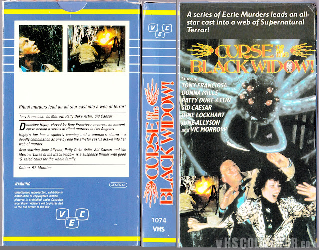
Curse Of The Black Widow

Image
There's only going to be two things left when the bombs finally drop, and those are plastic and bad horror movies about spiders. This is one of the worst covers I've ever seen, just outright. First off, leopard print wearin' Rocky Horror Show knockoff on the front there doesn't look so much scared as they looked excited, like they're about to have a night out on the town. Meanwhile, their friend right behind them, who doesn't seem to be looking at anything in particular, has absolutely NO reaction on his face and thus it's hard to exactly understand what he's trying to convey other than the feeling of, "I really need to use the bathroom right now." That's how people who try to hold it in look. Prove me wrong. Then you've got the spider, which is a pretty good spider, I'll admit. I've seen worse spiders, let's put it that way. This spider's got nice big scary mandibles and some wicked eyes. That's a pretty good s...