
Death Wish Club

So, I guess I'll start off by saying that this cover looks a rainbow vomited onto a fart.
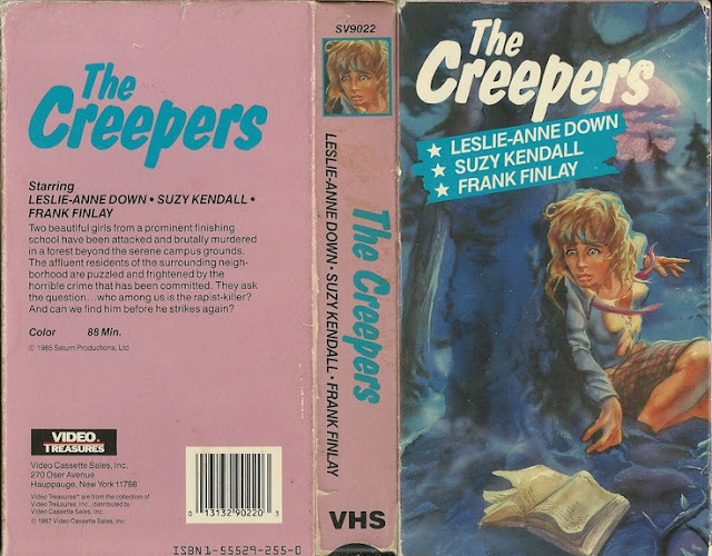
Like, visually, that's the first thing I think of upon seeing this color palette. Now, while at first glance this may appear not all that interesting to look at, there's actually a lot more going on here than you'd think. Let's start with, once again, these companies hiring the absolute lowest tier artist possible to draw their horrifying humanoid creatures they've plastered on the front of this monstrosity, that I sincerely hope aren't actual representations of the people in the movie, because if they are, then god those poor ugly people. Again, if you're going to through all the trouble of financing and producing a filming a picture, why would you drop the ball at the very last part of that? Why would you hire the worst people to create the thing that's going to be the first visual representation of your finished product on a shelf somewhere? Makes no sense. And maybe they just don't care, that's possible, as a lot of the film industry is just a cash grab with as little effort actually put into the project as possible to get as much gain as possible by doing as little as possible, but still, you'd think even then they'd create something semi decent looking that would trick the potential consumer into purchasing or renting the thing. Otherwise how you gonna make any money, you know?
Anyway, let's move on from artwork to color palette because my GOD MAN, who picked these? I mean, this is quintessential 80s colors right here. This is like someone who visited clubs and did cocaine every single night picked these colors. It's eye catching, not gonna lie, but you know what else is eye catching? Cows on fire. That doesn't make it good. You don't wanna watch cows burn, do you? Of course not, that's horrible. Just because something catches your eye doesn't by any means make it nice to look at, it just means it was graphically interesting enough to pull your attention towards it. So yeah, color wise, it looks like the physical embodiment of some kid in the 80s with roller skates on and a backwards space hat telling you how RAD everything is. The back of the box also has the word COLOR blasted over it, obviously telling you that the film is in color, but goddamned are they not wrong, this box is also in color.
But actually, and you may be surprised to learn this, my problem with this box doesn't come from the look of it. Oh sure, I could go on all day long about how awful this thing looks, but that isn't what made me want to talk about it. What actually grabbed my attention was the description on the back, which reads thusly:
A handsome young gigolo offers a pretty young girl huge amounts of money to live with him. Soon they become members of an eerie club where the only common bonds are exciting ways of committing suicide.
Now look, this...actually sounds right up my alley, not gonna lie. That's kind of a brilliant premise, except, it doesn't really fit together. I mean, some young handsome dude offers a pretty young girl huge amounts of money to live with him and then they become involved in a club that's sole purpose are finding exciting ways to kill themselves? What's the club, The Republican Party? Alright, even I'll admit, that was a bit of a cheap shot, but this is my blog goddammit and I'm gonna take those cheap shots, so there. But even so, even with that description, it doesn't fit the image on the box.
Like, okay yeah, we've got our handsome guy and pretty girl, or whatever constitutes handsome and pretty in this artists context, but this thing looks like a spy movie or something. He's holding a gun, there's a kung-fu silhouette going on in the background, there's a skull for some random ass reason and a bug on some guys hand, and then on top of all of that, there's a pair of gun sights on a pair of dice. Are they....are they attempting to assassinate fuzzy dice? What the FUCK is going on on this box? Because it sure as HELL doesn't sound like the description on the back. I also like that there's only two names on this box art, thus insinuating, in my head, that there's only two people in this movie and they play every single role and they were so ashamed of it that they demanded their names be on the BACK. Neither of those names sound real, either, which, I guess if I was in this, I'd use a pseudonym too.
I mean, I guess one could argue that's not really kung-fu and just looks more like one guy kicking another in the crotch, would I guess could be an example of an exciting way to die, but even then that's not suicide. That's someone kicking you in the dick until you're dead. That's just dick homicide.
And that is the dumbest thing I have written on this blog so far. I may in fact simply up and change my URL to www.dickhomicide.blogger.com (PLEASE DON'T GO THERE, I DON'T KNOW IF IT'S A REAL DOMAIN OR NOT) because that's the best domain name ever for anything.
But kung-fu crotch kicks aside, seriously, this thing doesn't work together. So let's do what we normally do at this stage and look into the (possible) Wikipedia page or other history, shall we? So, in my research, I actually hit a bit of a brick wall, because for some reason, this movie seems to have 4 different titles. See, there was no wikipedia page for any movie listed under any of these titles, nor for Regal Video, the company that apparently published this, but I did find it listed as a segment or something in a totally unrelated film called "Night Train To Terror", and now I'm not sure if this box art is real, if it's fanmade, if it's a release for solely this segment, or if this was an actual entire film and they simply chopped parts of it up for "Night Train To Terror"? I...don't know what I'm dealing with here, I'm just gonna come out and say it.
From what I can tell, it was an entire film, but they might've used part of it for this anthology horror movie? It goes by Death Wish Club, The Dark Side Of Love, Carnival Of Fools and Gretta, and the wikipedia for "Night Train To Terror" claims this is part of the "Gretta" section of the movie, which insinuates to me that they simply used part of this movie for their movie or something like that.
I really...I don't know, guys. But, because I love you guys, I did a little more digging. There's both a Letterboxd review and an IMDB page for this film, which corroborates my idea that this was in fact a full feature and they simply used parts of it in the other movie. So here's some screenshots for you.


So there we go. Now we know. Boy, that was a hell of a rabbit hole, wasn't it? I promise to not pick something so goddamned convoluted next time, but, then again, I don't really know these things are going to be convoluted when I start them, so don't blame me if shit goes off the rails partway through. Let's just call it my "process", because that's what pretentious art types do, right? Cool. I wanna say one final thing. While I couldn't find any information on the company Regal Video (to be fair, I didn't look that fucking hard), I do like that their initials are essentially RV. Because that's kind of the feeling I get when I see this. Just some shitty old RV, in some shitty old RV Park, filled with a story you never wanna hear about how it got there in the first place.
And that's it for this post, guys. Maybe I should try and track down the other films in Night Train Of Terror and see how bad their box art is, yeah? Perhaps we could have an anthology of our own here.


Comments
Post a Comment