
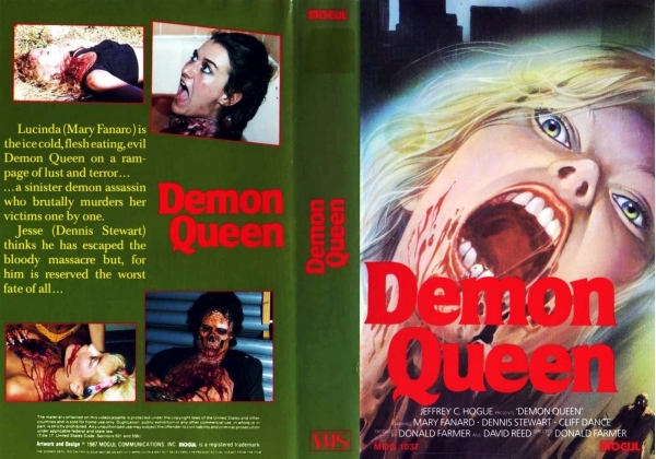
Demon Queen
It feels good to go back to your roots, the place you came from, like with this blog and how it started with just god awful horror movies. And nothing says "god awful horror movie" than a terribly drawn cover and puke green box coloration.
Demon Queen is a movie of such little notariety that Letterboxd has a single sentence for its synopsis. That's what you call a good time. From the screenshots on the back, it's incredibly clear right from the get go that we're dealing with renegade movie makers here. This is clearly not a studio backed project, because, even in 87, when this thing was birthed, with the gruesomeness of horror becoming a mainstream staple of cinema and a somewhat respectable genre finally, studios wouldn't back this sort of thing.
Just look at what's there and you'll understand why. It's just a bunch of brutally murdered women, horrors favorite subject to violence, and someone with their face melted off their skull. A pretty cool effect, actually, at least from this visual standpoint. Can't say it works in action, as I haven't seen the movie. But from this image alone it looks kinda neat. Like a 70s Ghost Rider, but without the flames. And it doesn't help that the coloration of the whole thing is wrong, from beginning to end. The puke green was bad enough, but when meshed with the blood red of the title font, and then that chartreuse on the back for the synopsis, just....my god man, did a colorblind person make this? This is awful. But my personal favorite thing about this box is how they put the title on backwards on the spine. It should be facing the other way! Glorious. Nobody gave a shit. I love it.
"but for him is reserved the worst fate of all"
And what's that? Being in this movie? A pretty bad fate to befall someone, yeah.
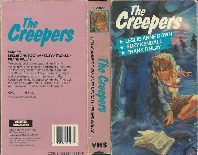
Now, on some level I have to respect the guys who just made their work and put it out there, especially in the era of physical media and especially in the era of physical media such as VHS when you had to find a real distributor and not just do it yourself. That takes guts and gumption, and some other 'g' word. So on some level, yeah, I respect the hell out of this sort of thing. But I don't respect your terrible box art, that's for damn sure. You could've just picked black. Black, over that puke green, would've alone made this a thousand times more visually pleasing to look at. Black goes with everything! Well, you'll be glad to know, dear reader, that this isn't the only box art I managed to scrounge up for this. Let's take a gander at another, shall we?

The only reason this isn't more enlarged is because there's nothing really to read and the imagery is all but the same schlock as before, except somehow seemingly less violent. But what I appreciate here is the front box. Sure their font on the spine is still fucking backwards - glad to know they had a vision and stuck to it - but the title font itself is way cooler, the box color is black (I told you! Black would be better!) and we're given, instead of a cheesy rendering on the front of a blonde who, I don't even know if she's a victim or the villain, this fantastic imagery on this one with a naked woman with a hole in her throat.
Much better overall to view. But you know what actually makes this whole thing interesting? That art from the first one is on like a bunch of different VHS boxes. Don't believe me? Take a look! It was apparently created by Les Edwards and commissioned for the book Star Child in 1976. Here's the art for Starchild.

That's right. Not even a movie. It's a goddamned book. Written by a guy whose middle name is, for some reason, Mustard, he was an american novelist most notable for the works "The Mephisto Waltz" which was made into a film starring Alan Alda in 1971, "Six Weeks" in 1976 which was then adapted in 1982 for a film starring Mary Tyler Moore and Ellis Island in 1983 which became a CBS miniseries the following year. So how'd this end up on other projects? Well, apparently Edwards work was not solely for one thing, and it would often wind up on various projects in various mediums. This is just one case of that happening. But it didn't stop there! Because then it also showed up on a movie called Gates of Hell.

But the fun doesn't stop there. Oh no sir, we have one more box to cover today, and that's the final place I could find this piece of artwork showing up on. That is a movie called Nightmare City, and, what an appropriate title really, because that's where I feel like I am right now. Trapped in a rundown motel in Nightmare City.
So Nightmare City is a movie from Spain made in 1980. It's a pretty standard "people turn into ghouls and try to take over the world" sort of plot, with a surprising twist of not actually being a zombie movie and instead being a "radiation sickness" movie with hints of both anti-nuclear and anti-military messages. Here's the masterful box art for that.

In standard VTC form, we have just the image, a font and a color. We've seen VTC quite a bit on this blog, and for good measure, because their boxes are always just so very bland. Nightmare City puts a creature in the background of the image, but on the whole, it's basically the same image. I don't know that I've ever come across anything like this before, where a singular commissioned image - for a project in an entirely different medium, mind you - then goes on to enjoy extended life on a myriad of covert art for other projects. That's just fascinating to me. I'm sure it's happened before, I almost guarantee it, but for as long as I've been running this blog now, I've never once heard of that and so it makes this a very unique case.
So that's Demon Queen and its subsequent boxes, a lot of which, mostly, came out before Demon Queen, ironically enough. Have to admit, I kind of like the actual piece of art itself enough to hang on my wall. Unfortunately, now every time I'd look at it, I'll just be reminded of this hot mess of musical chairs. All in all, an interesting topic to cover, I think, and worth looking into. If you know of any other box art that this happened to, PLEASE inform me, because I find it incredibly interesting.
Until then, I don't recommend seeing any of these movies. I don't even recommend re-reading this post. Once was enough, for both of us.


Comments
Post a Comment