
The Headless Eyes
You guys.
Come on, you guys. This isn't hard. Why is it so tough for you to make something that isn't incomprehensible visually? I just...I don't even know anymore, man. Every single week I have to come back here and teach you guys about graphic design, and you're the ones presumably doing graphic design for a living. How is this even possible? Alright, let's get into it, I guess.
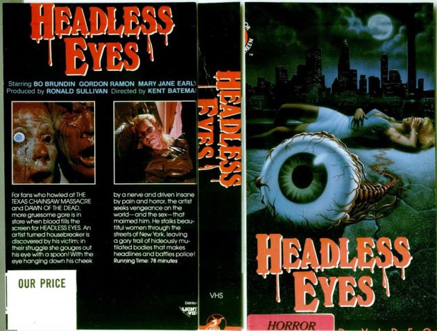
For what it's worth, let's start with a compliment, and that's that the artwork itself isn't all that bad. That's a nice look eyeball, despite the title making it sound like there's multiple eyes, but whatever. Let's ignore that for now. But seriously, top notch artistry went into visually crafting that eyeball, and I love him. The bleakness of the background, the city in the distance, the woman who - I'm assuming is a victim, unless that's HER eyeball that crawled out of her skull, which would make sense given she's covering her face with her hand - is lying on the ground in a pained manner. The colors of everything and the details of the eye, this is a really solid piece of art.
And that's about where the compliments end, really. First of all, there's no denying that the visual they were going for here was something reminiscent of "The Crawling Eye", a B Horror Movie from the 50s. Even if the plot is nothing like it, that's absolutely what this visual was going for, I guarantee it. Second, and more importantly, could you have picked two less visually appealing images to appear on the back of your cover? That does not entice me to want to watch this movie. Also the premise outline sounds like it was written by an 8th grader, it's all run on sentence and no real structure. I suppose the title font isn't terrible, but it certainly is extremely generic. It's a title font we've seen again and again and again and just screams "this is a horror movie!"
But you know what? All flaws aside, it's ultimately not that bad. I mean, it could've been worse. It could've been THIS.

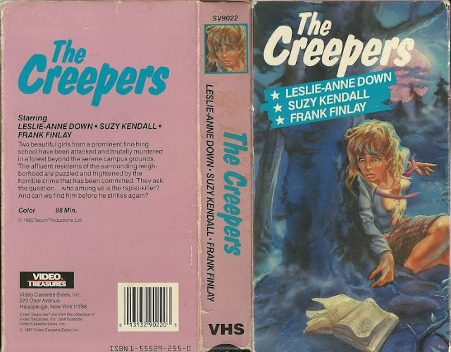
In what looks like a downright parody, this thing is so hilariously bad that I can't even knock it that much, because just look at this. Just look at it. It's so goddamned goofy. Who would be scared of that skull? He looks so friendly! And the font is ALL WRONG. The "headless" is the horror cursive we've come to expect, but it's white for some reason, and the "eyes" are impact, and it's the red one! What the fuck happened here? Also can we just touch on the fact that the title for this is literally so descriptive that it's not even interesting? You could've named this a million other things, but no, you named it after what he literally does in the movie. He rips the eyes out of your head. You went for the straight forward title, and boy howdy is it bland. Headless Eyes sounds like a metal band, not a title for a horror movie. And even then, not a very good metal band, either, for what it's worth.
I will at least give this box credit in that the screenshots on its back side are nowhere near as awful as the ones on the front. So the first box's front has a sweet ass piece of artwork, and the second box's back is a lot more well designed. If only they'd just combined those two into one fantastic box instead of two boxes with shitty halves.
Also, I don't appreciate the insinuation the tagline for the second one gives.
"Your ultimate nightmare!"
How do you know? You don't know me, you don't know what my ultimate nightmare is. You think everyone has the same ultimate nightmare, that we all share in the abject fear of having our eyes ripped out of our skulls? I don't know anyone, honestly, who has that as an ultimate nightmare. I'm pretty sure I'd be more afraid to find out snakes had been living in my butt than having my eyes torn from their sockets. Being set on fire would be worse, or maybe being eaten alive. Being eaten alive is quite possibly my ultimate nightmare, not even kidding now, and comparatively to having my eyes ripped out, it's far worse. My eyes get torn out, I'm just blind. No big deal. Learn braille, get a seeing eye dog, move on with my life. No moving on with your life once you've been disemboweled and digested by a hungry lion. It's not my ultimate nightmare, is what I'm trying to say here, and I'm offended that you thought it might be.
Is this the worst I've ever covered? No, not by a long shot, is it even remotely close? No, not by a long shot. Hell, both put together don't even begin to add up to the worst I've ever covered. As I said, I genuinely like the piece of art on the first on, and the skull on the second is so goddamned goofy that I can't help but love him and want him in my home as a permanent fixture. No, these are nowhere near the worst box arts I've ever covered, but that also doesn't forgive them of their sins.
I understand that back in the 80s we weren't the graphic design gods we are today, but how could it have really been that difficult to make something coherent, visually? To make sure things line up, and had imagery people would wanna see? It can't have been that hard, man. It just can't have been.
Fun fact! The writer & director of this movie was Jason and Justine Bateman's father, and it was produced by Ron Sullivan, a cinematographer with a background in pornographic films. How one decides to go from producing porn to producing...well...this leaves a lot of questions, honestly. Questions I don't think any of us are even remotely ready to begin asking, nor having answered. Questions like "does this guy have a fetish for eyeballs?" and "what in gods green earth is wrong with you, Ron?"
Headless Eyes is probably - in all honesty - good schlocky fun, but that doesn't excuse poor box art. As I said, this is nowhere near the worst, not even remotely close if we're being honest, but it still has problems, and I intended to point those out.
I'll see you guys next week, if I haven't been unceremoniously dismembered and devoured by a pride of lions, I guess.


Comments
Post a Comment