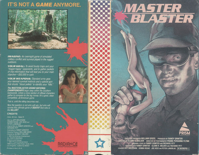
You know, I know it's common place for men to call their beloved objects by female pronouns, for example when referring to their classic Camaro they may say "Isn't she a beaut?", but I think this one might go a little too far. Master Blaster, contrary to what its cover might indicate, is sadly not a film about a maniacal evil genius who makes tiny women into guns, which is a shame, because that sounds endlessly entertaining. Instead it's a pretty cut and paste concept we've seen a million times before regarding a competition based around money that goes horribly horribly wrong, much like the production of this movie I would imagine.
Front art aside, I think my personal favorite part of this box design is the spine, which I can only assume was intentionally left blank so when friends viewed your shelf of films they didn't see this alongside others. The artwork on the spine looks like the cheap tablecloth used at a local family run pizzeria, which only makes the whole thing ever funnier. Honestly though, this isn't the worst thing I've ever covered. This is, surprisingly, somewhat competent. I mean sure, tiny gun women aside, the rest of the design itself isn't too bad and even sometimes borders on the alright. I like the little blood splash on the back that shows the name of the company releasing this copy, Radiance, and even the screenshots pulled for the back aren't all that bad either. Generic, certainly, but far from the worst we've ever seen.
Hell, it even bothers to give us a little blurb that isn't super vague and actually makes the movie sound a lot more appealing than it probably is. Whoever did this decided, "I'm gonna shoot for sheer mediocrity" and boy did they accomplish that goal with flying colors. In the case of the spine, multiple flying colors, even!
But thankfully we have some variants to work with, so let's look at one right now.
Easily the coolest of the three available, this one is so over the top that I can't dislike it. Sure, it doesn't feature tiny gun woman - who I'm now naming Diana for the remainder of this post - but man it's got so much more to love in her place. We have a better artistic rendering of our lead that doesn't look like the outcome of a high school art class project done the night before deadline, and even a chick in pseudo army fatigues joins him this time. The font is way cooler, way more personality with the little blood splatter behind it, and the back goes with the tried and true film reel screenshot collage, which is always a nice touch. That being said, despite what I just wrote, this is far from good. This is just so bad it's good. Of course, this release appears to be of German descent, and those folks know how to make kitsch.
The film, just for a little padding here, was released in 1987 and its Wikipedia page consists solely of its cast list - not even a premise blurb for god sakes - and of the 22 people listed on said cast list, only 4 have their own Wikipedia pages, and those 4 aren't names I recognize. We're in uncharted territory here, lads. It was also distributed by a company called Overseas Filmgroup, which is the most "this is just a tax shelter" name I've ever heard from a company in my life.
Like I said, this second iteration is definitely a step up from its previous version, but when the bar is so low that's not exactly a high compliment. And somehow, and I can't believe I'm saying this being a raging lesbian, adding a hot, half naked woman with a gun doesn't really make it better. I guess there's only so much one can do to improve the visuals of something so bad to begin with.
So let's look at our third version then.
Once again we are deprived of Diana, the tiny gun woman, and really this one just looks as generic and cheap as possible. It almost makes it look like an outright war movie, which it obviously is not. The font is boring as hell (somehow even worse than the original font, which I didn't think was possible) and while the screenshots on the back are in their own unique little containers that are angled in funny ways, that alone isn't enough to salvage the absolute visual nightmare that this box is. Sure, this one actually has a spine with a title on it, but I'm kinda partial to that weird multicolored tablecloth from before. That spine had nothing to prove. It was just cool.
This version was released by a company called New Dimension Home Video, and if this is the dimension this video hails from, then we're all in a lot of trouble. I love boxes though that carry consistency. You'll notice, despite the minor variations between the three, they really did come up with one pose for our lead and then just reuse it in different ways across all 3 versions. I appreciate that. There's something comforting in familiarity, even in shitty box art.
So that's Master Blaster I guess. Sorry there wasn't much more to this. While the second I think is easily the best, just because of its over the top design, the first is my favorite, if only because it features a tiny woman as a gun and that is goddamned hilarious. The others, frankly, should've followed suit. Honestly, they should've just made that movie. Like, someone kills this guys wife, so he invents a gun with her DNA and the gun can talk to him, and he and his wife gun go and get revenge on the people who killed her. That's a better movie just in concept alone than whatever was on this VHS. If anyone wants to make that movie, please just cut me a residual check. You can mail that check to me at my personal address here at:
Maggie Taylor
1478 Should've Done More With Her Life Boulevard
The real question however is this. If you make a gun out of a person, then use said gun on yourself, is that suicide or murder? If anyone has answers, let me know.


Comments
Post a Comment