
The Alien Dead
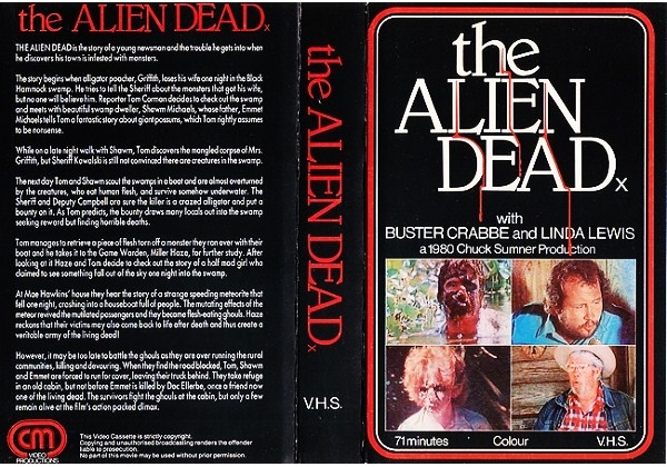
A meteor hits a houseboat, which causes the people on board to become zombies who eat alligators and eventually people.
There's...a lot to unpack there. First of all, it doesn't sound like it has anything to do with aliens. But I guess "alien dead" sounds cooler than "meteor dead". Just because something comes from space doesn't automatically make it an alien. A meteor is not an alien, guys, and it doesn't change these people into aliens, it changes them into zombies. This thing is a fucking trainwreck. So, with not much else to go on, let's see what's behind cover #2, shall we?

Well, this is...kind of better, I guess? If you can get around the goofy EC comics level artwork, it's at least a bit more coherent. Though the back is, once again, devoid of almost anything beyond a, once more, overly lengthy description and the same exact artwork from the front that they clearly just copy/pasted. Couldn't even come up with a 2nd zombie? Really? Alright. Well, I've always been one for hand drawn cover art on VHS boxes and posters (or paintings, don't have to be drawings, whatever), so this isn't all that terrible. The coloring is pretty decent, even if, once again, it does look like a 50s dime store schlock novel. So how about cover #3?

It's nice to know that even by the DVD age, they STILL couldn't get their shit together enough to make something really good. Now two things to note: the first is that there's way more than just 3 covers to this thing, believe me. There's so many that I actually had to whittle it down to my absolute favorites. Secondly, upon first glance, this DVD cover doesn't look all that bad, I know, but it is, and allow me to tell you why. First off, the entire thing clashes with itself. While you've got a really neat pseudo 50s poster art on the front, you've got a terrible 90s collage back to support it, and those two just do NOT go well together. And even then, the artwork on the front isn't even all that great. I mean, it's by no means bad, but let's dissect this thing, shall we?
It's pretty bare bones. We've got a scantily clad girl, to lure in the horny crowd, being dragged away by what appears to be a sexual predator Skeletor, and then what I'm assuming in the background is the houseboat from the film? But it's all painted like a fucking Thomas Kinkade image, and then slapped over it is that goofy ass Outer Limits font. This thing is as frankensteined as you can get, really. Meanwhile, the back is even worse, because it's lacking any artwork whatsoever, which breaks the entire flow of the thing, honestly. If you're going to give the front a fancy art design, give the back the same treatment so that the whole thing is coherent. But nope, we're treated once again to the ever present "back contextless image collage". Cause those never get old.
The front is so bursting with color, even if it's the same color as what you find in the toilet the morning after a night binge drinking, and the back is completely devoid of color. What the fuck. That's just poor decision making making is what that is.
But my absolute favorite part of the DVD cover? The fact that they stuck half the naked drawn girl from the front on the spine. I find that absolutely fucking hilarious. Because what if it's on a shelf, and you can't see her? Well have no fear, we'll stick the hand drawn tits front and center! This box, though not VHS, combines the worst aspects of BOTH the previous boxes into one absolutely glorious monstrosity that defies all logic and comprehension.
So that's The Alien Dead. If you want some more hilarious cover art, I highly suggest looking them up on Google, because goddamn there's a TON of it, man. Also, one last little note, the director of this film was Fred Olen Ray, and he also co-wrote AND shot it, and I'll admit, that's pretty impressive. A jack of all trades. He's actually been cited as a widely inspirational figure in the independent film industry. But that's not what the note I wanted to leave you with was. The note I wanted to leave you with was that this man, this myth, this legend, he was once also a professional wrestler, named Fabulous Freddie Valentine.
I just...that tickles me.


Comments
Post a Comment