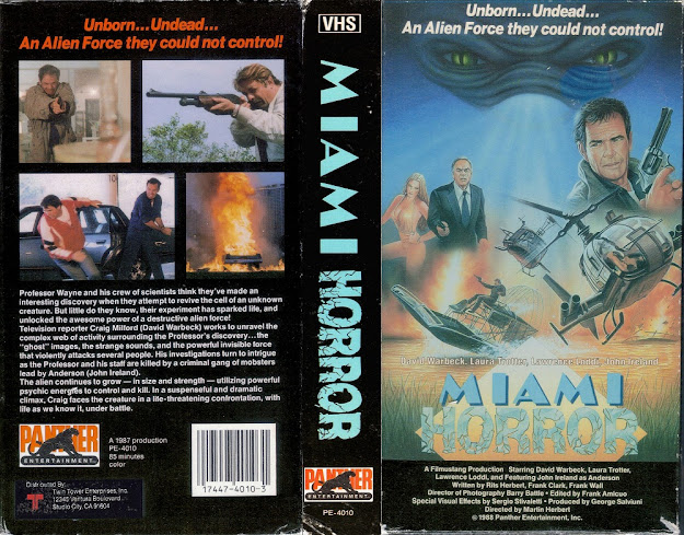
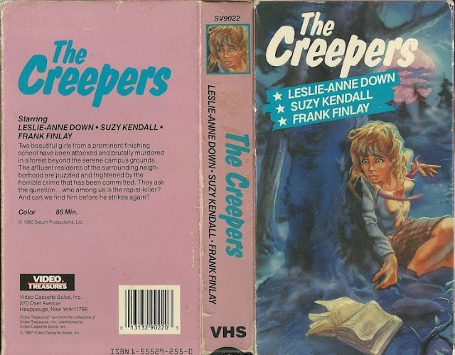
The Hollywood Strangler Meets The Skid Row Slasher
If this blog has anything resembling a tradition, I'd be willing to say that tradition is covering terrible movies about strangulation. Whether it was The Invisible Strangler or Night Of The Strangler, we seem to run across this genre in particular far more than anything else, don't we? Well, I'm happy to officially make it a regular ongoing tradition! So long as I keep stumbling upon terrible strangulation films, I'll continue to share them with you, whether you like it or not. So with that in mind, let's discuss this box. It...isn't...terrible, I guess? It's not great by any stretch of the imagination, nor is it vaguely visually imaginative but, it's also not outright atrocious. It really at least gets the message across, if nothing else, even if that message is just "people get strangled".
Despite the title sounding like a sleazy, terrible Abbot & Costello title, I've always personally been a fan of dueling serial killer concepts. This appears to have been put out by Vegas Video, which sounds like a Hollywood Video knockoff, and really, I think the worst part about this whole thing is how it's so completely at odds with itself. You've got a fairly gruesome image on the front coupled with a goofy bubbly purple font, and the back is so very plain it barely warrants a second glance whatsoever. This really feels like a mishmash of ideas that nobody really thought about asking whether or not they worked well together. Also the film, according to IMDB, only runs for an hour and twelve minutes, which just barely qualifies it as a feature length film. I'd like to, however, take particular notice of the very tiny font in the bottom corner of the back cover, which reads thusly "Suggested Retail: $59.95", meaning they were trying to sell this pile of schlock for about 60 goddamned dollars, and this was 1988, when 60 dollars could've probably bought a house. The gall, the audacity, the goddamned balls.
However! Something the back cover doesn't actually mention is something that a review on IMDB brought to my attention and made me all the more genuinely interested in regarding the film, and that is that the Skid Row Slasher is a woman. It's rare you get to watch women gut people, so I'm all for this bottom barrel equality, honestly. There is also apparently not a single spoken word of dialogue in the film, just basic narration added over prerecorded background music. This sounds like a treasure, really, doesn't it?
But, as bad as that first box might be, it pales in comparison to this awful piece of trash.
This thing, this absolute monstrosity of what can only be described aptly as a graphic design hate crime, featuring someone named Smokey Sinclair (which sounds like a porn star) and imagery of apparently when they found Saddam Hussein holed up in the ground. Also nobody ever thought to check whether or not these fonts meshed well, because, uh, news flash...they don't. And what's with the puke green overlayed on the black with the gruesome red font on it? Who...who approved this? I know I'm a woman so apparently it's innate to me, but...doesn't anyone know how to match colors? It shouldn't take an interior decorator to recognize that none of these things go together in any good way at all. But, that's a tired old argument, I recognize, and I've beaten it to death, so perhaps instead of saying this is a great example of stuff not meshing well, let's instead call it what it is. A fucking affront to good taste and eyesight. I mean, sure the differences in the font could be attributed to the concept that the Hollywood Strangler gets a more Hollywood style font while the Skid Row Slasher gets a very gross slasher font, and I can get behind that, but there's also a way to make things work that whoever it was that designed this didn't care to figure out.
Also, and maybe this is a stupid question but why is there an old timey radio in the bottom of the back corner and on the spine? It's a bit cut off so there's no real way to figure out if it's a brand for a VHS company, a production company or what, but it's strange either way. I used to have a radio that looked exactly like that, but I never would've thought to use it as a symbol for something, especially not a production company, especially not a production company that is more video oriented than audio related (granted, sound and film go hand in hand, but you know what I mean).
So that's another strangler VHS in the hopper, I guess. Maybe I'll keep coming across them and make it a regularly ongoing tradition, who knows? It's the closest thing we have to one so far, which is...sadder than I'd like to admit, but I guess that's normal for the line of work this blog is.
So remember, don't trust people in hollywood, don't trust graphic designers who've only taken a beginner course in photoshop and especially don't trust any women who willingly hang around on skid row. They're clearly just looking to murder. I'm a woman, so take my advice on this one, guys.


Comments
Post a Comment