
Aerobicide

This fucking thing, man.
There's so much wrong with this, and all its subsequent variants, which we'll also cover. Let's start with the sheer fact that this womans proportions are absolutely ridiculous. I'm not a very big breasted lady myself, but holy god damn, this woman is more tit than person at this point. Seriously, this lady probably has back problems because of the size of her chest, it's ludicrous. I'm not against using sex to sell something, and sex and horror often go hand in hand, but this thing is oversexed to the point where it makes me almost wonder if it's just a porn parody of a horror movie. Of course I know it's not, but still. The images on the back are of no help, because we have a woman screaming at seemingly nothing, a man who appears to be aiming a gun, and then just TNA everywhere else. They were really depending on horny movie goers to rent this flick.
Also the grey surrounding everything else is just an odd color choice and kind of takes me out of the visual aesthetic of the whole thing. You couldn't have just made it black? Why grey? The boxes inside the grey are black, why not just keep that consistency throughout? Oh, right, look what I'm talking about. I'm expecting consistency from these people. Nevermind.
Now, granted, this is also the german version, and, not to be too culturally rude but the germans are pretty lenient when it comes to sexuality. America, while pretending to be puritan, ain't far behind them when it comes to depravity, but the germans still have us beat. If this is were the case, I'd let it go, but it's not, because the other versions are just as terrible.

Here's yet another foreign version, once again promising more titillating action than horror I guess. What makes this one even worse is they simply recycled the same images from the back side but mirrored some and moved some to the front! They couldn't even be original in their artwork, they just utilized what pre-existing assets they had and moved 'em around a bit, hoping no one would care. But this one is even worse to me, honestly, because at least the first ones front cover had a sort of creepy glow to it. It's dark, there's mist and light, you can kind of get a sense of horror from it, even with Tits McGee front and center. But this one? This literally looks like a porno. And even worse than that is the backside where they just have a lineup of hot chicks! I'm a huge lesbian, but this is too much even for me, guys.
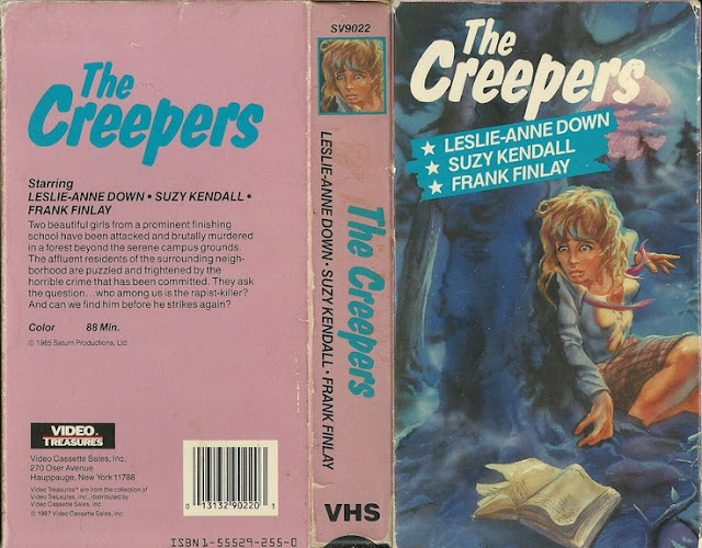
So before we go any further down this rabbit hole of pain and confusion, let's talk about what the movie is actually about I guess. It's a slasher from 1987, and it centers on a Los Angeles fitness club owned by Rhonda Johnson (a pornier name I've never heard) whose twin sister Valerie was burned in a tanning salon two years ago. After several of its members are killed by an unknown attacker who uses a large safety pin to kill their victims, Detective Morgan begins to investigate the gym, and, might I dare to assume, Rhonda's pants as well.
A more basic premise you could not ask for. Eye candy that gets killed. Simple as that. I mean, we've all seen a movie like this on late night cable. It's just utter trash. In fact, Aerobicide isn't even its actual title, that was just what it was once called. It was later renamed Killer Workout, because if it isn't pun based, it isn't a trashy 80s horror movie. So, I hear you ask, what does the cover for Killer Workout look like then? Don't fear, friends, I've got it right here for you because I'm always ready to deliver.

Alright, now we have something to work with. Something that at least vaguely resembles something real, and not a parody. I'm not saying it's any better, but it's at least what I'd expect from something like this. This cover, for example, is an actual cover. It shows a woman working out, she's not oversexualized or anything, and a hand smeared with blood running across what appears to be a cracked mirror or window of some kind? I didn't say it made sense, I just said it was better. Cohesiveness does not always mean quality. On the back we're given a few more rather scantily clad ladies, but at least this time we're also given some downright graphic imagery to go along with it so you know for a fact that this is actually a horror movie and not simply something masquerading as such.
And for once, the blurb on the back doesn't suck! It's not overly informative but it gets the basic point across without giving too much away. How hard is that for people to do? It's not that goddamned difficult. Just write a small blurb, guys. If the folks behind this thing can manage to do it, so can the rest of you.
And while the third box is in some ways the most visually appealing and at least accurate to the movie its portraying, it's almost in many ways the most boring, because it lacks all the sexual interest that the first two had. Frankly, I don't think any of these really work. The first has potential but doesn't know what to do with it, the second is a hot steaming pile of garbage and the third is just too bland. How do you fail at 3 variants of a box cover? I'm impressed. And while the third is obviously the clear winner if we'd have to pick one, solely because it's actually the most coherent to what the movie is, it's still just...really....meh. I'm not saying I prefer the sexual overtones of the others by any means, but they could've done something more with this at least. Maybe made the front a little more violent? I don't know.
I know that far too often I ask for far too much from these boxes, but just once, just one time, I'd love to come across a variant that's head and shoulders above the rest, you know? That's such a clear cut winner, that's just so obviously better, that it makes the others look like preschoolers made them. That would be so wonderful.
But until that day comes, I guess I'm stuck with what I get.
Really, this is my own fault, as I started this blog.
I made this bed, and now I have to shit in it.


Comments
Post a Comment