DevilFish
Just when you thought it was safe to go back to the video rental store...
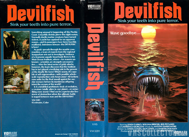
We're back with yet another monster fish movie, because that is just such a super viable subgenre on the horror world for some reason. And I guess it's not that surprising, in the end. The ocean is endless, vast and practically unsearched, so we don't know what horrors lie in wait, and that's pretty terrifying. That being said, this is one of the more mixed box arts I've covered, because it's both awesome and terrible, somehow. Before we move on, let's just state the obvious...DevilFish is a TERRIBLE title. There's no getting around that, alright. It makes it sound like Satan possessed a giant fish and is now causing havoc off the shore of a beach, and that's just lame, man. Satan's got better things to do. Also, the tagline, while not terrible, is actually pretty bad in this context, as it implies the viewer is the DevilFish, seeing as humans don't sink their teeth into things for terror, unless they're cannibals I guess.
This thing is all over the place is all I'm trying to say.
Design wise, though? Pretty solid, overall, actually, especially when compared to some of the other "giant evil water based monster" movies we've featured, like Jaws of Death and The Great Alligator. Like, the color scheme, and even the painting itself, is all pretty decent. In fact, my only complaints lay with how the fish was put into the image and of course the generic run of the mill screencaps on the back. But the fish doesn't look right. It doesn't look like it belongs there. It should look more like it's in the water, not just superimposed on the water. I mean, they went through all the trouble to make the person drowning's flailing arms look like they're coming up from the water, so why not do the same with the fish, is all I'm sayin'.
But either way, this is actually a pretty solid box. But, surprise surprise, Devilfish is actually the American title for this movie!
The movie, a 1984 Italian film from the master Lamberto Bava, is actualled called "Monster Shark", which is an even worse title, frankly. At least DevilFish has some sort of identity to it. Monster Shark is so very literal it's like calling the Michael Myers franchise "Stabby Man".
It's also known as "Monster From The Red Ocean", which sounds like an anti-communist movie from the 50s, "Devouring Waves", which makes no sense considering nobody is eating water here, and finally, "Shark: Red In The Ocean", which, as far as I'm concerned, isn't even a complete sentence.
All that being said, this box art is somehow even worse. While the creature looks like it belongs more here, they also superimposed random humans from the film in front, instead of the general arms, which I think fit better, and the red tone of the cover really actually detracts from the overall feel. The back is also - along with the font - godawful. Somehow the first cover is actually better for once, which is rare. Here we've got the kind of font you'd use for a 3rd grade book report typed at home and the general yellow box on grey background, with a singular image of a plane flying over the ocean. All in all, this one just reeks of someone shouting, "Just get it done, man!"
This release, however, seems to have learned from the mistakes of the others. Despite keeping that red filter, it also kept the flailing arms in tact, made the fish look more like it belonged in the water and, shock of all shocks, gave us a slew of screencaps! Also the font actually isn't garbage. It isn't great, but it's not terrible. I've just always been of the opinion - as someone who does graphic design for her own projects - that a title should be one font across the board most of the time, and this double font thing always looks sloppy, but hey, that's just me. Sometimes it works. This just isn't one of those times. Overall, while the first one was acceptable and the second was awful, this one seemed to find the perfect balance, and overall I feel like this one really is the best one of the bunch, I'd say, despite never having once heard of In Video, but good job guys, you got it, you got the best one, and I can't even imagine anyone topping this in any way at-
Alright. I apologize. This is the coolest damn thing I'll likely ever feature on this blog. My god, this is fantastic. A full shark jumping out of the red water, over a flailing arm, with a fantastic title font and a kick-ass singular screencap on the back of a helicopter blowing something (presumably said shark) up in the water. Yes. This is art at its finest. Nothing will ever top this. No shark VHS will ever even come close. I want to hang this on my wall to impress the ladies.
So simple, so basic; an image inside a rectangle on the front, with a fantastic painting, and a good combination of colors from the blue font to the black of the box proper. This is peak box art, and I for one would love to shake the hand of the genius who created this masterpiece. This makes me wanna go get eaten by a shark, it's so cool.
If I don't come back next week, let it be known it's because I was inspired by this box art to dive into a hungry shark infested water somewhere.
I may have eaten my words, but they'll have eaten me, so it all evens out in the end.


Comments
Post a Comment