The Great Alligator
You know, any movie that just sticks a generic title on it - whether or not the movie is excellent or terrible - deserves to be mocked. You really couldn't come up with anything better than "The Great Alligator"? I know it's also titled just "Alligator", but that's even more boring. At least with the "great" in there you have the hope he might be an alligator who's also a magician or something. Just the singular addition of that word immediately opens up a whole world of possibilities! What a fantastic idea, actually, an alligator magician. Claims he can make you disappear and then fucking eats you.
This is yet another Gorgon release, and I have to say, this is awful. Again, their logo is the best part. The font is so-so and could work in another piece, but here it just...it doesn't do anything for the box design. It doesn't subtract anything either, don't get me wrong. It's absolutely unintrusive, which sometimes can be a good thing but here I think it doesn't add or subtract anything to the overall look. Still, even the font is the best part of this design, which says a lot considering the font is so unimpressive in and of itself. First of all, and let me just make this as perfectly clear as one can to anyone out there even remotely interested in graphic design...
...yellow and green do NOT. GO. TOGETHER.
I don't care what color theorist you might've spoken to, or what any other artist might have told you. I'm an artist, and I'm here to set the record straight once and for all that yellow and green is one of the most bastard combinations we as a species have ever managed to come up with. There aren't a lot of color combinations that are outright vile, and while some people argue that primary colors can't be mixed, I argue they often can, so I differ a lot from other artists when it comes to color theory. But this isn't a theory. This is a fact. And the fact is that yellow and green looks someone vomited, but their vomit was coming out of their nose and is now covered in boogers. It's that gross. So are we all clear on this now? Good, I'm glad we had this little talk. And if at some point in the future you feel perhaps somewhat inclined to dabble in mixing yellow and green, please, get help immediately.
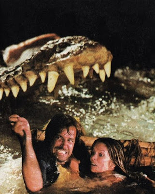
Otherwise this is just a standard boring box. Oddly placed screenshots on the front, no screenshots on the back, and a little blurb about the movie. It's as basic as it can come, quite frankly, proving that, yes, even basic can be done badly. But there's actually something about this box that is an outright graphic design sin, and here it is.
Anything here look wrong to you?
Well, perhaps the untrained eye it looks fine from afar, but when zooming in you can clearly see that these are two separate goddamned images, one placed upon the one, and poorly at that. Now, I recognize photoshop didn't exist in the 80s, shit, I was born in 89 and to me photoshop was a real moment of the future finally arriving. I know that the option for photo editing was minimal at best in the 80s, okay? But this? This is down right inexcusable! They didn't even try to make it look like they were in the same picture as the alligator, it's just so very obvious this was a quick cut and paste job.
I've seen some bad box art in my day, especially while running this blog, but most of it was understandable. They were either cheaply produced movies that didn't have a lot of money for artistry, or they were simply shitty variants from other less companies or foreign countries, but this? Look I know this is a foreign film too, but holy crap dude, this is so not okay. This might be the single biggest goof I've ever seen, and mostly because it was so avoidable, and yet they didn't even try to avoid it. They deliberately embraced this fuck up. That's...oof. That's sad.
But we're not done yet, folks. Oh yes, we've likely seen the worst, so it can only go up from here, but fear not, we've got some variants for you! I'm nothing if not a generous woman, after all.
Now, this variant is much better. I mean, it's the same shitty art from the first one on the front, but at least it's tinted to sort of look like they belong there and not so grossly obvious that this was baby's first photo job. But there's actually a lot to like about this box, if you'll allow me to run through it real quick. First off, and this has nothing really to do with the movie, but I love that Videocassettes font. That is absolutely killer, man. Kudos to you guys. Also, not sure who exactly Techno Alm is, but love that too. Some absolutely excellent 80s shit going on here. But okay, the movie art itself. Well, the front is still shitty, but it's slightly less shitty at least. Apparently someone somewhere at some point in time noticed what I noticed and took it upon themselves to course correct as much as they could, so thank you random person.
But the back is actually the shining spot here.
We've got some design work here that is actually solid. You've got some headshots of characters in the film, which actually works, and a mother fucking fantastic piece of art in the bottom half, really emphasizing just how "great" this supposed alligator is, and boy is it nice to see something well made after that first abomination. Honestly, that's such a good piece of art I'd like to just have it to hang on my wall. The description is vague, but brief, and good enough to warrant piquing your curiosity without sounding outright stupid, and alright, the title font is actually worse here but I can forgive that because the rest of the box is so much better than the first one.
It's weird, you'd think a company with a cool name and logo like Gorgon would have better artwork but for whatever reason they kind of strike out every time, which is a shame because I want to like a company that - while they don't really exist anymore I'm sure - at least was original on some level. But alas, this is not the case, so.
Either way, this Videocassettes version is spectacular. And, for what it's worth, there's a whole slew of Videocassettes releases and they're all pretty great. These guys really put effort into what they did and I for one appreciate that. But perhaps my favorite thing I came across for this movie was something that isn't even a full box.
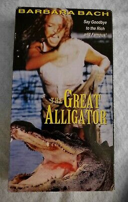
This is my favorite thing I found in relation to the movie, and I'll tell you why for a few reasons.
First of all, without any context, this is just a hilarious piece of work. The image looks like she's about to do a WWE move on an alligator, while the tagline reads "Say goodbye to the rich and famous!" almost implying that the alligator is rich and famous and this poor down on her luck gal is doing her part to right the world, Robin Hood style.
Meanwhile, the title font here is the least fitting of all, and looks like it belongs on the box for fucking Homeward Bound. Also, the nerfed alligator size really makes it seem like he's not that great after all, and is in fact easily destructible. If Barbara Bach can take him down with an elbow punch, then he's not much of an alligator, is he?
So yeah, there's a lot to love about this one.
The Great Alligator as a film might in fact be great, but it's box art clearly swings the entire spectrum of godawful to hilariously goofy to fairly decent and beyond. I appreciate a movie with levels. All in all, it's just another example of variants differing in quality because of who they're associated with. Now, the sad thing is that I don't know who released this version, but this On Golden Pond looking piece of work really deserves the most recognition. Sure, the second is arguably the best, but this one is so goddamned goofy that you can't help but love it. Anything that dares to be - or hell, doesn't even dare to be but just winds up being - that gloriously stupid deserves recognition.
I still wanna see a magician alligator though.


Comments
Post a Comment