The Demon Murder Case
Well, I gotta hand it to 'em, they certainly found a title that explains outright what the movie is.
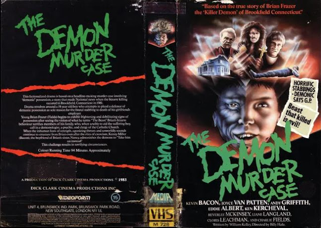
I mean, let's face it, it doesn't get much more direct than "The Demon Murder Case." Not only does it specify what kind of court case is being handled here, but who's being arraigned as well. Yessir, really knocked it outta the park with that one. And despite this being a seemingly actual movie, starring Kevin Bacon and Andy Griffith (a more bizarre pairing you could not produce) and produced by Dick Clark Cinema of all companies and people, that doesn't let this box art off the hook. I mean this thing is...wow. It's not the worst thing I've ever seen obviously, not even close in fact to the worst thing featured on this blog thusfar, but it's also not exactly excusable. Who's great idea was it to combine Bacon's face with that of a demon? Because kudos to you, sir or madame, because that's hilarious. That isn't threatening. That just looks goofy.
The font is the same generic spooky font you see on every single horror film released around this time period. That font, honestly, was the MVP of the home video market, if we're being honest. That font deserves a reward. I personally though appreciate the giant MEDIA stuck on the spine. Why was that necessary? Were they afraid someone might be confused and think this was a book so they put MEDIA right over the "VHS"? I'm not knocking it, I love it, I'm just so baffled by it.
And the back isn't even worth discussing, because there's nothing there. Your title again, your credits at the bottom, and there's not even screencaps. Just text describing the movie. So very very mundane. Thankfully, this isn't the only box we have!
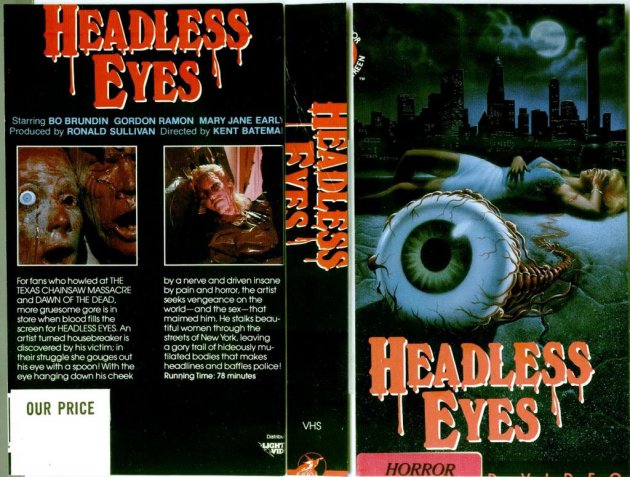
Here's what I'm assuming is the German version, titled simply "Brian". Much less direct a title. No indication of what's happening in the movie, or even really who Brian is. I'm gonna assume however that Brian is the giant disembodied head on the cover surrounded by fog, which really doesn't work. When I think of the name "Brian", I don't think "Evil".
Also that demon. We gotta talk about that demon. A mixture between one kind of joke I can't come up with and another kind of joke I can't come up with. This is your classical commissioned painted cover, complete with bad anatomy and all. I'll give it this much, while the title is nowhere near as interesting, the font is at least new and the artwork - laughably goofy as it is - is certainly better than what was presented above. Plus, the back has stuff on it now! Was that a cost cutting measure? Did they just sometimes not put screencaps on the backs of VHS's to ensure they wouldn't cost as much to produce? I'm genuinely asking. If so, it couldn't have saved them that much money. But even with this new box, we only get two screencaps, and neither one is really worth discussing. They're pretty bland.
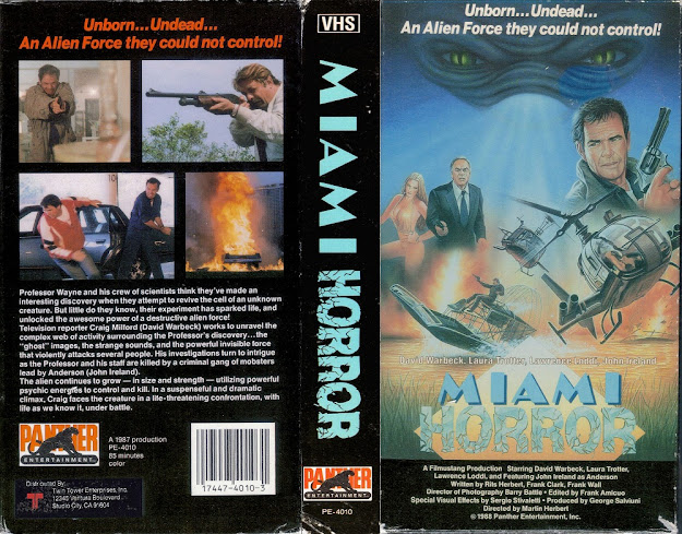
But you know what? If this second cover is the best, and not because it's good but just because the others are so much worse, I'd wager to say the third is absolute dog shit.
These people didn't even TRY.
Okay, a pretty neat font, certainly, in fact perhaps the best font out of them all, but that's all they get from me, praise wise. Sure, we get 3 screencaps this time, but they're all still uninteresting, and the front is the least visually enticing of them all. Now we've got that ridiculous split face from the first one, but they're not even combined, and then Kevin Bacon's pretty mug sitting right dead center, just in case you didn't know he was in the movie, ya know, like his name plastered right on the top wasn't evidence enough.
It's also got a grey scheme, and that's just never a good look. Black always works guys. Black is the go to color. We're once again graced with that "Media" logo, which is apparently the name for a company called Media Home Entertainment Inc, which is about as generic a company name as you can get, but it's no longer on the spine. In fact, the title font is barely on the spine. Now I can't say whether or not this is a decent movie. I mean, it's got Kevin Bacon and Andy Griffith in it, and presumably a demon of some kind who murders, and it's supposedly based on a true story? And it was produced by Dick Clark's media company? It's got a lot of things going for it honestly, except these box arts, but I haven't seen it so I can't say.
You know, it's no secret that most of the movies presented on this blog are horror movies of some kind or another, and I don't think that's shocking in the slightest. I think horror movies just lend themselves to more creativity - for better or worse - than other genres when it comes to making cover art. I mean, 9 times out of 10, these posts are going to feature horror movies, and that's just because those are the ones that, back in the day, got the most ridiculous covers. But ya know what, I think it's worth it. The horror genre is ridiculous enough as it is that it can withstand some equally ridiculous cover art and frankly, just because something is bad doesn't mean it's inherently worthless. If anything, it makes all the more worthwhile because bad is what people remember.
So here's to you, bad horror VHS art. You really are the backbone of this dead industry. I don't know whose backbone, exactly, but I'm sure you ripped it out of someone, and I'll give you an A for effort.


Comments
Post a Comment