
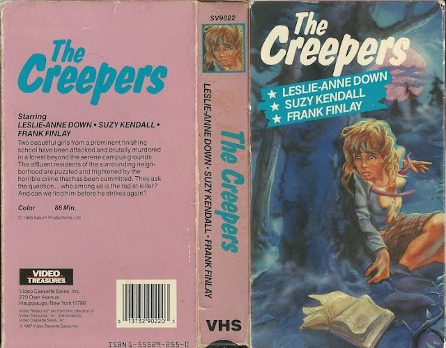
The Capture of Bigfoot

You know how there's people who call every single soda a "Coke" or every single Pokemon a "Pikachu"? I feel like Bigfoot is lumped into that group as well. Even though Sasquatch, Yeti, Abominable Snowman and Bigfoot are all 4 different cryptids by definition, it feels like they all just get called Bigfoot no matter what, and frankly I'm sick of it. And I'm sick of this box art. Why's this Yeti look like he's about to score a backboard shattering slam dunk in the Alaskan NBA? I'm also a little confused at the font that looks like it'd be on a hundred year old copy of Pinnochio, but at least it's trying to be unique. It's not just some generally ubiquitous font, so I'll give them that much credit. Actually, I'll also give them credit for sticking the Yeti head on the spine. That's a neat little touch.
But that's about where the compliments end, honestly.
And it's weird because this isn't a terrible box, but it's also just so very generic and whatever that it begs the question "does this even deserve to be torn down?" because it's that utterly unremarkable, and those are the hardest boxes to analyze, honestly. Also, not to harsh on the title too much, but from the description, it doesn't sound like these people are doing very well at "capturing" this thing. In fact, it almost sounds like the opposite is happening, and they're being relentlessly slaughtered by this Yeti. This version was released by a company called Active Home Video, whom I've never heard of before, so that virtually guarantees it's a great underrated gem, right? Nothing screams "cinematic masterpiece" like "released to an unknown distributor".
And boy did they want you to know who was responsible for the release of this thing, because they plastered their logo and name on this thing not once, not twice, but three times. The front, the spine and the back. It's almost like a guy who talks about all the sex he had, when in reality he never has any sex at all. The thing is, the guy who directed this is also the guy who made Monster-A-Go-Go and The Giant Spider Invasion, so he's not some unknown schmuck. He's a fairly well recognized and, in some cases, respected cult filmmaker. Active sure isn't though. Can't find a single thing about them, and probably for good reason.

But at least the first cover is an original piece of artwork. Goofy as it may be, that was one thing about old cover work and posters that I appreciate is how they actually commissioned people to do full scale paintings for these things, unlike this Troma release (and yes, I recognize it's ridiculous to ridicule Troma) which essentially falls into the category of "Fuck it, put Bill in a poorly constructed Halloween costume and have him stand in a dark room for thirty seconds while we take his picture."
He doesn't look like a Yeti, he looks like a Japanese demon in a parka. And why is the image spliced like it's the front cover for a Mafia movie? Who designed this monstrosity and how do I thank them for it? This is an example of so many poor ideas executed so well at the same time that I can't hate it because it's so ludicrous. I admit, I do like the footprint they put near the title font, that's a nice little touch, but otherwise this thing is an aesthetic nightmare and I couldn't be happier with it.
But you know what? Neither of these compares, even in all their lackluster glory, to the absolute weirdest of them all.I present to you...this poster.

This doesn't look like a poster for a pseudo monster movie, this looks like a poster for a metal band. Why's he in that striking pose like he's about to bust out his greatest hit? And why the 1974 Ski Resort font? And, perhaps most offensive of all, why's he just look like a giant Gorilla? See, this is what I mean when I say that nobody can apparently agree on what a Bigfoot is. That's not a Bigfoot. That's just an uglier King Kong who's mad that he's not allowed to order more drinks while on vacation and starts to attack the wait staff as a result.
Sure, at least unlike Bill's Halloween costume photo in the back room of their office, this is an actual commissioned painting as I mentioned earlier, and sure it's nowhere near as terrible as the first cover we looked at, but why's it go so hard? I love it when an artist - even though likely fully aware the project isn't worth the pittance they're being paid to produce it for - goes the absolute mile for the dumbest assignment. That's true appreciation to the craft, and I thank them for it.
Capture of Bigfoot seems to be yet another attempt to cash in on the "nature run amok" category, or rather "cryptid run amok" if that's a subgenre (not certain it is, frankly) that was sort of popular at one time, but that doesn't excuse it for its misdeeds. Like, yeah, I'd absolutely hang this poster on my wall because god damn if that isn't the coolest thing I'm gonna see all week, but overall I think this film really hammers home the issue of a lack of consistency between publishers. That's why you have eighty two separate box arts for each movie released around this time and somehow, despite them being the same film, they look nothing alike. Consistency, even for the worst shit, is key, guys.
Then again if anyone were consistent in quality, I'd be out a gig, so...
...maybe forget I said anything. Carry on.


Comments
Post a Comment