Mindstalk
You know, you'd think after doing this blog as long as I have been that I'd have seen the bottom of the barrel, but every now and then something comes along that proves the barrel is even deeper than we originally thought, and this weeks movie, "Mindstalk", really hammers that point home, I think.
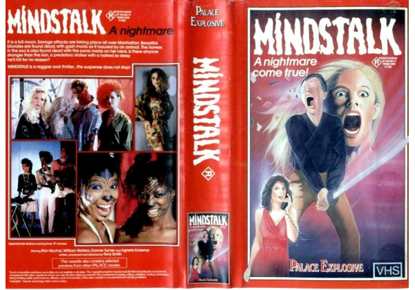
"A nightmare come true", buddy you couldn't be more right. That tagline sums up the feeling I get from laying eyes on this visual abortion as much as anything could. Released by Palace Explosive VHS, an apparently well known company that actually had a fairly unique and cohesive style of box art through their tenure, this thing is anything but unique or cohesive. In fact, this is a rather unique post because for perhaps the first time in the history of this blog, there aren't any variants that I could find. But perhaps that's because it goes by a completely different name altogether, "Murderous Intent".
Released in 1985, the film is about "a writer who becomes suspicious of his beautiful young wife. He dreams about a bizarre musician and a suspected serial killer who's stalking women in the city."
But even then, I could only find so much information on it, as there's another film from 2007 starring Toni Collette with the same title AND another film from 1995 with the same title! So, perhaps in hindsight, "Mindstalk" is the better name of the two, if only because it sets it apart from a whole group of similarly titled movies. But boy howdy, is that somewhat unique title all they really have going for them. This thing is a masterpiece of abominations. The faces, my god the faces; in fact, that's the face I made the first time I laid eyes upon this thing!
There's actually one neat aspect about this that I will give praise to, and that's that they put the cover of the box on the spine. I think that's an extremely cool idea, and I'm honestly surprised I didn't see that mirrored by anyone else. But that's it. That's the only thing they get praise for.
Director and writer Len Anthony is also known for (well, perhaps "known" is too polite a term. I don't think this man is actually known for anything) other films such as "Fright House", released in October of 1989 with a tagline that reads "Home is where the heart stops" which might just be the stupidest thing I've ever read....this week. His other film is 1986's "Vampires", which, well, that one's pretty self explanatory honestly. The man really prefers straight forward titles, and there's nothing wrong with that honestly. But there is something wrong with making bad movies, and even more egregious, bad box art. Now I know he's not responsible for this eyeball bleeding visual, but I'm going to blame him anyway, if only because I don't have anyone else to directly blame for inflicting this upon us.
I mean, it's actually not a terrible box design in and of itself; the general aspects are all there, as always we've got the collage of random screenshots on the back, a semi goofy font title and while I think the red is a tad garish myself it definitely is eye catching. But that art on the front. My GOD. That's the horror of this horror movie, my guy. And why's he holding a sword? And why's he look like Nic Cage just stubbed his toe? And why's this look like a 13 year old drew this? This is just so goddamned ridiculous on so many varying levels it's almost hard to know where to start, not that Murderous Intents cover is any better, mind you.
While this one at least has the feel of a classic Universal monster movie poster, it's still so bad for so many reasons. The font's now gone from goofy spooky to downright comical, and why is there just an eyeball floating in the middle of this primordial soup of blue incomprehensiveness? None of this makes any sense visually. Plus, now instead of one womans disembodied head floating in the background, we're treated to TWO disembodied heads floating in the background, presumably the stars of the film, which is odd given the woman at the bottom is seemingly the focal point of the visual (which I'm sure the eyeball would agree with, given they're staring at her).
I will say, at least the this one has some sort of artistic merit. The detailing on the dress is extremely good, and in fact the detailing on pretty much everything is extremely good, not to mention the overall color scheme. Hell, even though the title font now looks like it was ripped straight off a Marx Brothers movie, the coloration of it among the icey blue and white background really works together, so at least we've got that going for us. But all in all, while the first is so bad it's great, this one is so generic it's unmemorable, and that's not any better really.
So what have we really learned here today? Well, I think we've learned that you can't just paint things and expect them to be as good as the old masters. Sure, whoever painted Murderous Intent at least understood things such as color theory and generally how faces work, but overall it's so bland, so easily forgettable that it is actually less interesting than Mindstalks, which is at least so awful that it's downright hilarious and worth discussing. Those faces are going to be seared into my brain for the rest of my life, and I hope I've done the same to you all now. You're welcome.
...AND WHY IS THAT WOMAN IN THAT SCREENSHOT FACEPAINTED LIKE A CAT?
WHAT IS GOING ON IN THIS FLICK?!


Comments
Post a Comment