Blood Shack
Listen, I don't think I even have to explain this, but when a building has a name that specifically implies what occurs inside this building, or what it's representing, you might want to steer clear of it especially if that name is dangerous. For example, I don't go to Pizza Hut and ask for tacos, because it's a hut that serves pizza. Same reason I don't go to Radioshack to try and buy books, because it's a shack full of electronics. Do you see what I'm saying? So it only stands to reason then that if a place is called Murder House or Death Row or, in this weeks case, fucking Blood Shack, that yeah, perhaps you shouldn't go poking around in it.
It's just common sense, really.
I mean, what do you really expect to find inside of a Blood Shack? Blood, presumably. Possibly even your own blood if you're not careful. So just stay the hell away from it. It's not like you're going to find buried pirates treasure. It's not called Pirate Treasure Shack. Blood Shack, also known as The Chooper and Curse Of The Evil Spirit, is a film released in 1971 that was made with about 500 dollars tops, which, yeah, sounds about right. By the way, all 3 of these titles are extremely specific. Blood Shack refers to the place in which the blood will be spilt, The Chooper is the sound effect of the victims being killed and do I even need to go into Curse of the Evil Spirit? It's fairly self explanatory as far as I'm concerned.
What is with these people who can't come up with more original titles? If you're going to be specific, then why not make a whole line of movies with titles such as Hurty House or Murder Mansion or Deadly Domicile? You know why nobody does that? Because that's fucking stupid, that's why, just like Blood Shack is a stupid title. But we're not here to bitch and moan about the title of a movie from the 70s, we're here to bitch and moan about the artwork for that movie from the 70s, and uh...there's a bit to say about this one.
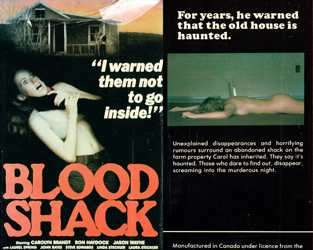
We're greeted yet again on the front cover by our favorite ever present "woman getting strangled" image, which never gets tiring, and what I can only assume is the aforementioned Shack in the background. The title font isn't bad exactly for a movie of this period and this caliber, but the font being alright doesn't make the title any less ludicrous, so. Also, another all time favorite recurring cover element, intentionally vague and unattributed quote! Oooh, it can only make you even more intrigued to rent and watch this, can't it? You'd think so, but that's not really the case here. See, the issue with movies with names like Blood Shack is that it doesn't leave much to the imagination. I know what I'm getting for 3.50 rental fee. A shack filled with blood. No surprises there.
But while the front is mediocre at best and expectedly crappy due to the time period and the budget they had, the back is an even worse offender, if we're being honest. The back is just solid black, with a single frame of a naked woman face down with a knife in her back and some white text that, really, isn't even the same font from the front. There's absolutely no visual continuity here except that both front and back and colored black and feature a woman in varying states of being killed. But I'd maybe let that go if there was more than just a 4th graders book report for a blurb. You remember when you used to do book reports in school? You tried to summarize it as quickly as possible:
"I read The Incredible Journey over the summer. It had 3 animals, two dogs and a cat. They get lost in the wild and have to find their way home. Eventually they find their way home and are friends because of it. The end."
It's that level of blurb. Also, "screaming into the murderous night"? Is the night the one who's killing these people, filling this shack up with blood? A concept cannot kill people. Night is a time of day, a concept, it can't be murderous. Maybe think next time before you just decide to type whatever the hell you want on the back of a box cover, jesus christ.
But thankfully this isn't the only cover we were gifted. We also get this painted cover, which is, well, good and bad for various reasons. Let's start with the good. The font is exceptionally better. Not only does it look more appropriate for the film, but it's also somewhat stylized with the bottom half dipped in blood, which makes it way more visually interesting. Then you also get a way better tagline than that vague ass quote on the other.
"Open the door to a new kind of terror."
I mean, it isn't great or anything, but it's much better than some generic ass quote from the movie that doesn't really explain a damn thing. The colors, also, are fantastic, especially in regards to the shack itself. That dark blueish grey that is most of the house, except for the red tint? Such a good combination, man. Whoever did this really knew what they were doing. In fact I'm willing to bet they're the only ones involved with this film on any level who knew what they were doing.
And the cons? Well the guy is goofy looking and frankly not all that intimidating, and there's no changing the fact that Blood Shack is still a ridiculously stupid title. You can't unsink that ship. But between the two? Yeah, I think it's clear that this one is vastly superior and that that isn't really a shocking statement. I mean it's night and day, really. Murderous night and day, probably.
But I'd let that be the end of it, except there's one other cover we have to talk about, and that's a cover released for the retitled version of the movie, "The Chooper", or as it's called on the box, simply, "Chooper". No, Chooper sadly isn't an adorable Pokemon, it's yet another terrible name for something, this time a villain, and likely because it sounds similar to "chop", as in he's going to chop you up for your blood that he wants for his shack. The whole thing is levels upon levels of dumb, really. But the cover for The Chooper? Oh MAN. You gotta see this thing.
In what looks like a flyer for an indigenous metal band, Chooper is really a sight to behold. Is it slightly borderline offensive? Probably. But it's still a fantastic piece of artwork that's yet again marred by being married to such a stupid fucking title. You got the feathers attached to the arrow sticking out the top of the skull, you got the snake coming out one of the eye sockets, I mean this thing is actually brimming with visual originality!
And though it lacks the exceptional colorwork of the previous, I think it actually benefits from being greyscaled. Would this look neat with color? Sure, I suppose. But it looks all the more eerie due to lack of color. This is just a really exceptional piece of work that's sadly attached to a really unexceptional piece of work, and for that, it's forever somewhat tainted. However, I wouldn't doubt people have tattoos of this bad boy somewhere, because come on, this is absolutely a motorcycle gang symbol if I've ever seen one.
So what can be gleamed from this whole thing? Well, I think it's safe to say that, aside from that first example, the people doing the artwork for these really were actually talented folk. The same cannot be said for the people making the movies. But, as I've said time and time again, this isn't a movie review blog. This is a movie cover review blog. And more lambasting than reviewing, to be fair, so.
There's one other little tidbit I want to share that I found out while researching this stuff, because I find it absolutely fucking hilarious, and that is that while the movie had a limited theatrical run, clocking in at 70 minutes, it was - for some reason - edited for home video release down to only a mere 55 minutes. That means someone, somewhere, thought to themselves "jesus, this is atrocious, how can I make this easier for people to endure?" and then edited it. You're doing the lords work, nameless editor. God bless you.
So that's Blood Shack for you, in all its various glorious awfulness, or at least the ones I found interesting enough to expend upon. Now if you'll excuse me, I have to go to Foot Locker and see if they sell televisions, because that makes about as much fucking sense as going into a place called Blood Shack and expecting to be thrown a surprise party.


Comments
Post a Comment