Galaxy Invader
"So Joel, you wanna go take a fake cryptid photo and try to fool people into thinking it's real?"
"Totally dude! Let's go pull a faux Bigfoot, that'd be rad."
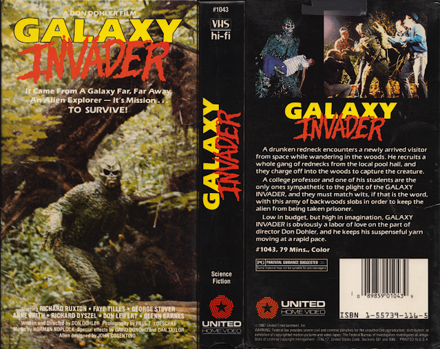
And thus, the cover for this movie was born. And boy is there a lot to love about this, in a really genuine way. It's still bad, don't get me wrong, but it's the enjoyable sort of bad rather than the anger inducing sort of bad. Let's pick this one apart piece by piece, shall we? We'll start with the cover, which looks like a bad attempt at fooling some local yokels that their livestock is in danger thanks to the sudden appearance of a swamp beast of some sort, just so you can weasel them out of their land and then build a mini-mall where their farms once stood, because, ya know, you're a villainous real estate agent from an 80s movie.
My personal favorite part of this box, however - and it's a very minor thing - is that they put "science fiction" on the spine, just, ya know, for clarification. In case you mistakenly picked this up thinking it was a rich and complex family drama or something along those lines. We've got two screenshots on the back, neither of which are all that interesting but at least are in line with what we'd expect from this flick, which is the creature and its interactions with the humans in the movie. One sees him trying to Black Lagoon his way into a womans heart, while the other, I'm assuming, sees him being harassed by a group of humans. Because even if you're a space alien, if you come to Earth, we're gonna bully you. It's just what we do.
The title font is a weird ass mishmash of colors and inconsistency. The "Galaxy" is bright yellow and a sort of impact font, but the "Invader" is more of a spooky type font with a blood red tone to it. The two colors don't mix, nor do the fonts themselves, and it makes the whole thing just a tad more perplexing than was initially intended, I'm sure.
But none of that is even the best part, honestly. The best part of this box is the description of the movie itself, because boy are there some gems in there.
"A drunken redneck encounters a newly arrived visitor from space"
Off to a solid start here, always a good premise to build off of.
"He recruits a whole gang of rednecks from the local pool hall and they charge off into the woods to capture the creature"
"Low in budget but high in imagination"
Yeah, you're gonna need to qualify that with some actual evidence please. Can't just outright claim that sort of thing without backing it up.
"GALAXY INVADER is obviously a labor of love on the part of director, Don Dohler."
If this is what a labor of love looks like, then maybe you should put in less effort. Just a thought. You might somehow make something better that way. Also quit putting your title in repeated caps. It's just annoying. Also what kind of movie calls its plot a "suspenseful yarn"? Maybe if the movie is about a group of women being impaled by the knitting needles of an ex member of their crochet group, then you could get away with it, but otherwise it's just weird. You made a movie about a space alien, my man. Oh, I'm sorry, a GALAXY INVADER. My bad. Don't try and oversell it for more than it is, alright?
All kidding aside, this is a nice change of pace from the usual garbage I have to ream here. Not that this isn't garbage, it is, but it's a different kind of garbage. It's the fun kind of garbage. It's the kind of garbage one can appreciate. It's like spraying your dumpster with lemon scented lysol. Yeah, it's still a dumpster, but at least now it smells nice. But that doesn't excuse the other versions of the box art for this movie. Oh, you didn't know about those, did you? Well allow me to regale you, simple reader.

Alright, okay, so this is clearly bad; the colors don't match up whatsoever, the font is - admittedly - rather cool, but still out of place considering how cheesy and downright hokey this whole thing comes off as, and I just in my right mind cannot imagine that they actually paid someone to do this for their box art. Unless this too, like the movie claimed it was, is a labor of love by the director, who I'm beginning to suspect might in fact be a 7 year old boy.
Also why's the GALAXY INVADER ripped. He's got abs. Does he work out at the space gym before descending on intergalactic rampages? Just a question. I mean, I suppose if you're constantly being hunted by another species that intends to do you harm, you might wanna stay in shape, sure, but between the random 6 pack and the face that more closely resembles a Luchador mask than an alien face, I'm wondering now if the GALAXY INVADER is even an alien, but instead just a confused wrestler who got a little too into his character.
But wait, there's more! That's right, we've got the trifecta here, the ever sought after triple play, because now I'm going to show you the third box art I came across!

So, right off the bat I have one extremely important question to ask, and that is this...why's the tagline on the first and the third box art contradict itself? The first one says "It came from a galaxy far far away, an alien explorer. It's mission...TO SURVIVE", but then the third one reads, "It came from a galaxy from far far away, an alien explorer. It's mission...TO KILL."
So which fucking one is it? And why's the professor and their student feel empathy for something that's so clearly trying to destroy them? Perhaps the rednecks were right all along! Maybe we have to rethink this entire thing. Because, honestly, from the first box's description, it sounded like they were simply a lost and confused alien who merely wanted to escape our violent planet and return to the safety of their own, but NOW I'm somewhat convinced that they came here with the intent to kill us outright, especially since it all but makes that point very clear on the back blurb here. Talked about your mixed messages.
Where as the first box was bad in a good sort of way, this box is bad in the regular bad sort of way. There's nothing inherently or remotely interesting about it. It's got your bland typical artwork as opposed to your goofy faux Bigfoot photo, and even the font - which was before outright laughably ludicrous but at least visually interesting, if not also visually confusing - is now just boring as well. This whole box is just BORING, man. The first one's so weird it's great, the second is so bad it's hilarious and this one just reeks of mediocrity, and honestly, mediocre box art is even worse than bad box art, because at least bad box art is still interesting in some regards.
Galaxy Invader, er, GALAXY INVADER, pardon me, seems to be an extremely low budget independent movie and, as an artist who works for herself, I for one can't really fault that. Make your art, live your art, I support it, even if it's terrible, because it came from you and that's something you can be proud of. But that doesn't mean I'm not gonna laugh at it on this blog. And really, I genuinely like the first box, I do, because it's so overdone in so many different ways but somehow, when pushed all together, those aspects fit and work and make it a spectacle to behold. I cherish that sort of thing. Really I dislike the last one the most simply because it's so absolutely devoid of creativity and originality. It's just yet another bad box on a shelf filled with other bad boxes in the back aisle of a discount video rental store next to the out of business chinese takeout in the strip mall.
And really, from the few images we get of the creature in the screenshots, he looks pretty cool, not gonna lie. I think GALAXY INVADER might be a movie actually worth checking out, and that's more praise than I can give most of the movies I cover here.
He came to invade our planet.
But instead he invaded my heart.


Wonderful blog post. This is absolute magic from you! I have never seen a more wonderful post than this one. You've really made my day today with this. I hope you keep this up!
ReplyDeleteskip bin hire darra
skip bins darra