Hands Of Steel
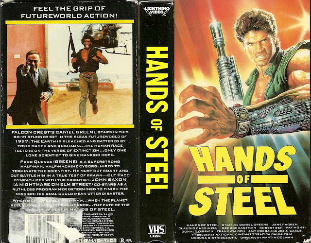
Let's get one thing straight right off the bat. This movies title is WILDLY misleading. Those are NOT hands of steel. That's an ARM of steel. Do you people even know what a fucking hand is? Why didn't you just call this movie "Arms of Steel"? Because it would've worked, because guess what, guns, which are clearly used heavily in the film, are also called "arms". You would've had a double entendre movie title! But instead, you chose to stick with "hands". Which makes even LESS sense when one considers the blurb on the back cover that states "he is a superstrong half man, half machine cyborg", because guess what, if he's a cyborg, and half machine, more than just his fucking hands are steel. You could've called this thing literally ANYTHING ELSE and it would've been more appropriate and accurate to the movie.
And let's not even go into the fact that the blurb also states that this movie takes place in the wildly futuristic year of 1997, which is a pretty gutsy thing to do when your movie comes out in fucking 1986, less than a whole decade before the year the movie is set in and claims to be "futuristic". In fact, according to the Wikipedia article for this film, the lead character is only 30% human! So yeah, you could've called this anything else and it would've been better, but no, you stuck with "hands" for some reason that I'll never be able to fathom. "Torso of Steel", "Biceps of Steel", or as I stated previously "Arms of Steel" which really is what this should've been called, but nope. Hands.
Actually, the name of the Italian version, which is the original, is Vendetta Dal Futuro, which translates thusly to "Vengeance of the Future", while in fact the American version is simply called "Hands of Steel" and another version was called "Atomic Cyborg" because someone at some point realized "yeah, that IS a dumb fuckin' title." But it's okay, because at least it was rectified in some regard. Though, not sure where you got the idea for "Vengeance of the Future" from, honestly. Future is not less than ten years guys, future is supposed to be, like, a hundred years. Get with the program. Also, fun fact, actor Claudio Cassinelli died in Page, Arizona, during production when he was on a helicopter that crashed into the Navajo Bridge. Okay, it's not a very "fun" fact, but it is a fact nonetheless. I may have wildly overstated the "fun" part of that fact.
And listen, I think I'm pretty lenient, I think that unless something is an absolute shit show, I'll give it the benefit of the doubt and cut it some slack. That being said, not even the back box art is good, because instead of the standard multi screenshots were usually get, this time we're given one giant one, and it's just the lead actor running towards the camera holding a rifle with a grin on his face that looks like he just got out of school for the summer. This thing fails in every conceivable, comparable way, front and back. Not to mention that the artist rendering of the lead actors muscles on the cover clearly do not match the actual actors arms on that image on the back. The artistic rendering would have you believe he's some sort of body builder, meanwhile that back photo clearly shows scrawny twig arms attached to a man channeling his inner Fabio. Meanwhile, the other guy in the back cover photo, the one in the suit, is aiming that handgun like a kid aims a water pistol. Pew pew.
God could you guys do NOTHING right with this?
The font is all wrong, it's not even cool looking, and it's yellow for some reason. A boring old slanted yellow font announcing to the world "Hands of Steel". Nothing about that font is exciting or eye catching, nor does it even remotely represent the movie it's been slapped onto. Not to mention the font on the back is even worse, and looks crammed together so badly that it makes it somewhat illegible at times. I won't lie, I had a fairly difficult time reading the back of this, simply because the font choice was so poor. It's entirely in capitalization. DON'T. DO. THAT (she typed, in all caps, sarcastically making a joke in a comedy blog post).
Like, this is one of the worst, if not the worst, covers I've ever...well, covered, not to be cute, because anything they could've done right, they didn't do. They took every misstep possible in graphic design, and that's unforgivable. You screwed up in every single conceivable way, and I find that just wildly mind boggling. It's not often that I run across a VHS box art that manages to do every single aspect incorrectly, but you guys did it, congratulations. Your trophy will arrive in 6-8 weeks.
Take your terrible font, your awful title, your horrible graphic design and your Jean Claude Van Don'tgiveadamn knock off and get the fuck away from me.


Comments
Post a Comment