Blank Tapes
 |
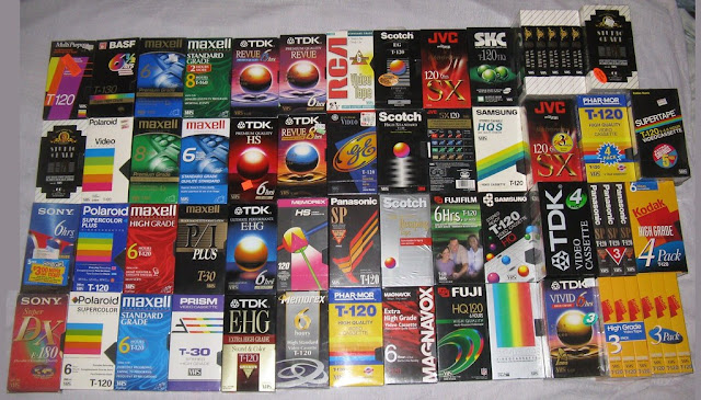
| Photo courtesy of cooldude166861 over at Flickr |
But it never occurred to me to talk about the covers of blank VHS tapes until someone brought it up recently, despite my love for and heavy use of them growing up. So that's what this post is going to be about, and then after this, we'll resume regularly scheduled roasting. This picture likely doesn't even contain every single example, but I certainly recognize more than a handful of these that I personally used, including the Fuji HQ120, the Sony 6hrs, the FujiFilm 6hrs and more. What's so fascinating about blank VHS box art is how timeless it is. It seemed sort of futuristic then, and fits so easily into the vaporwave concept of today. Obviously not all of these are great, and some are more generic than others, but more often than not, one thing becomes very clear the more you look at these, and that is this.
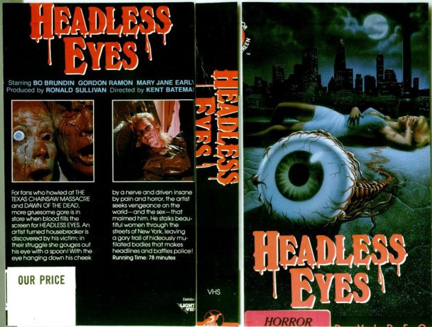
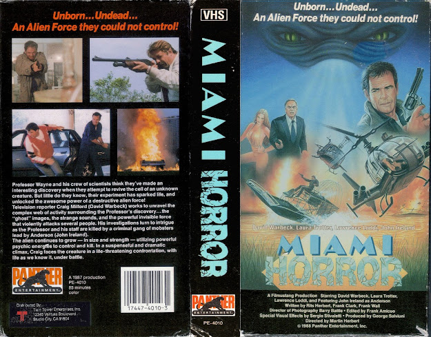
Most of these are more well designed and crafted and pleasing to look at than most of the actual box art I've shown you on this blog thusfar. That's...fascinating.
I don't know if these were made in house, if they contracted these out to designers, or what the overall situation regarding them was, but it's fascinating to me that something that was made for blank reusable VHS tapes often times had more interesting box art design than something an artist who was hired specifically by a studio to design major motion picture box art. Anyone who's taken any simple graphic design class, or does any graphic design themselves, like yours truly, knows that you can easily recreate something of the same sort of blank VHS tape box art within minutes with no real problems in any graphic design software. It's not hard. Sure, some of these were obviously made to look nicer than others, but ultimately, it's not hard.
But it's amazing when you attempt to compare these two things. Let's look at these side by side, shall we?
Like, the one on the left is something that was made to house a blank tape you could use to record stuff from television on. It wasn't the result of months long work on a feature length studio backed financed film starring a whole cast and involving a whole crew, it was just the end piece to something simple. Then on the right, we have the box for "The Heist" (which we will cover in the future, not to be cute) which someone, theoretically, got paid to design. Someone had to take that image, come up with the font, the design layout, etc, and yet...the 6hr Sony box just...is MILES ahead of the other, despite it being nothing but a box for a 3 dollar blank tape used to record reruns of MST3K. It's just amazing to me that some random assortment of text and a giant V could be far more cool to look at than something someone made professionally, and I use the term "professionally" extremely loosely in this case.
Honestly, I miss this weird proto vaporwave imagery for these blank boxes. I think it really just shows how sometimes, especially if done correctly, less can be more. It's also weird to me how many companies you wouldn't expect to get into this market got into this market. Like Sony makes sense because they're a tech company, but like Fujifilm is a little weird to me. I understand that film, as in movies, are an offshoot of film, as in taking pictures, but still. Maxell, TDK and Panasonic also make sense, but Scotch? Is that the same company that makes scotch tape? Did they just get confused and assume this was a new type of adhesive? And Kodak, they kind of fall into the same issue I've got with Fujifilm, where when you think those two names, you think photography, not filmmaking. Certainly, the two have very close ties, but it stills makes me feel weird about it. But not as weird as fucking Pepsi for some reason having a blank VHS box.
That's just straight up STRANGE, son. It's apparently a branded promotional item, but just...why? Of all the markets you could've done a promotion in, why blank VHS tapes? I mean, I get that it was a thing that was sort of new and upcoming and popular but...why is a soda company doing cross promotional items for a medium that wasn't going to last very long? If you've got the time though, and are interested in stuff like this, I highly recommend this post where someone recreates fakes in the style of this from other brands. It's fascinating and hilarious, and incredibly well done. Good job, guys!
I can't find any other information on this thing outside of the fact it was an, apparently, promotional product, and even that I only managed to gleam from the link I just put into this post in the above paragraph, so I can't really say much about this, which is a shame, because I'd love to talk about it in depth, since it's so wildly weird and interesting. But even this is better than the boxes made for actual feature films, and perhaps that's because Pepsi, being a major company, has a marketing department and so their graphic designer people actually know what they're doing, but that's just speculation. If anyone knows anything about this, please leave a comment and direct me to some more information, because I'm bewildered and delighted, and oh so curious. Thanks.
Anyway, I guess you get my point. I do graphic design work for a living; sometimes I get paid for it, but mostly it's for my own work, whether that's podcast covers or novel covers or, hell, blog designs like the header for this blog as an example, or any of this blogs sister blogs, like Face Your Fears and Crackin' Spines. I made all the headers for this stuff. It's just part of what I do as an artist. So when somebody professional, and again I use that term extremely loosely given the quality of stuff we've seen on this blog so far, ends up being far less interesting work wise than a weird ball on a multicolored background from TDK, it strikes me as both sad and hilarious. I also am willing to bet any of the people who designed a lot of these are now working on vaporwave album covers. Guarante it. Prove me wrong, internet, I dare you.
Or at the very least, it's where some of the visual inspiration came from.
Anyway, sorry for the long delay between posts, I was extremely sick and in pain for about a week, but now I'm back and ready to get back to ripping into box art! We'll continue in a few days with a new post about a new box, and boy will it be fun to get back to work. Til then, scour your attic, and see if you can find any blank VHS tape boxes. Who knows? They might just go for good money on Ebay. People buy weird shit, man.


Comments
Post a Comment