Tanya's Island
What is it with women and wanting to fuck monsters? Is there just
something wrong with us? I don’t know, but what I DO know is this: This
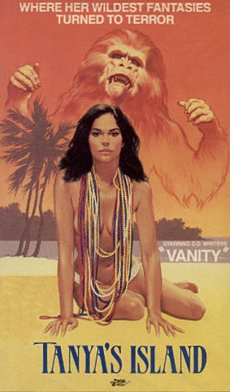
is a movie that exists, and this cover is as bland as it gets for a
movie that sounds as ridiculous as it is.
It’s written AND produced by a man named Pierre Brousseau, who doesn’t have his own wikipedia page for, what I considering to be, VERY obvious reasons. In fact, the mere acknowledgment of “writing” and “production” on this is funny on almost every level, since it sounds like something a teenage girl would come up with at 3 am. There’s not much really to be said about the movie, and this isn’t really a film review blog anyway as much as it is just as box art blog, so let’s talk some box art!
First and foremost, you got what EVERY single box art in the 80s/90s needed; scantily clad hot chick! And right below her? The most seemingly generic title in the world! How could you miss?! Aside from her beads, which she apparently considers to be perfectly fine attire in lieu of an actual top, the box art has absolutely no color whatsoever to it, leaving it rather bland and unimaginative. Then we got ape face up in the top, perhaps howling over his love for Tanya, or perhaps his love for her island? Is that an innuendo? Is “island” a code for something? I know there is an actual island in this film, but still, I get the feeling it’s a joke of some kind.
Ape man (whose name is Blue because he has blue eyes, since hollywood is ripe with originality) and Tanya are apparently having a torrid affair and she’s trying to be with him instead of her abusive husband. Fair enough. Ape man likely wouldn’t hurt you. I don’t know Tanya doesn’t fantasize about other humans, and instead chooses King Kongs lesser known twice removed cousin, but to each their own I suppose. Maybe she’s a furry, I don’t know. I’m not here to judge, alright? I mean, sexual preferences. I’m absolutely here to judge box art.
What bothers me is how often we get shitty box art but there’s variations on it somewhere. This is SO MUCH BETTER, and not just from an artistic standpoint, but just in general of how godawful it is. You’ve got the awful font, you have actual images from the film on the back, and then you have, smack dab on the cover, Tanya and her love with a man in a poorly made halloween mask. This is GLORIOUS. This is ART. That first cover is like eating at Arbys, and this one is like eating at Wendys. There’s absolutely no comparison. This thing is a step above. Isn’t that 2nd cover art just a wonderful image that you’d love to hang in your home? Well then do I have good news for you!
You can! Imagine buying this, framing it and proudly displaying it over your couch or bed every single time someone comes to visit! It’d be the best thing in your place, even better than your children, because your children, great as they may be, will never be as great as “model from the 80s tenderly loving a bigfoot ripoff with french text at the top.” It’s the french text that really makes it. It gives it such a more romantic vibe. Imagine wooing your next lover under this magnificent piece of artwork. I’m gonna find one on ebay right now.


Comments
Post a Comment